*Critique Club*
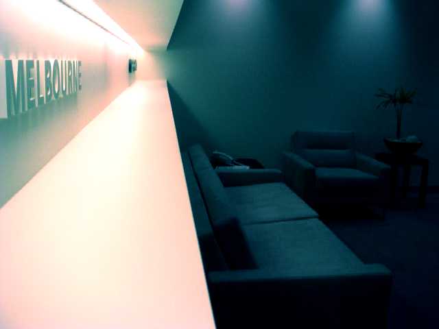
This has really interesting angles. I think that is quite visually appealing to me. I like how the lines lead you into the photo, even though they really don't lead anywhere interesting.
This photo gives me more of the impression of a business than a home. Almost reminds me of a doctors office, or waiting room of some kind. Still though, it shows that your home is in Melbourne.
The lighting to the left gets just a tad bright on the shelf under the writing, and also in the crease above the writing. however, the lighting on the word itself seems good.
You show us enough in the dark area to be able to see what it is, but not enough to really make it jump out as something interesting. I like the seperation of the photo by color. The pinkish on the left and the blue on the right. I also appreciate that that seperation is not directly in the center of your photo.
~Heather~
I don't know how to react to this image. At first, I like it. The lines are cool. The contrast is intersting. But the more I look at it, the more I don't like it. I almost with there was less data on the right side. Or maybe it could be cropped tall just right of where it turns from white into black.
Interesting angle shot. Focus seems pretty good (esp. for as dark as most of the room seems). Looks more like an office than a home... The darkness of the room....I just don't like it. 6 Rob the Swash






 Add photograph to your favorites
 Add photographer to your favorites

 Photographer found comment helpful.


