Hi Nico, this is Bruno writing to you from the Critique Club,
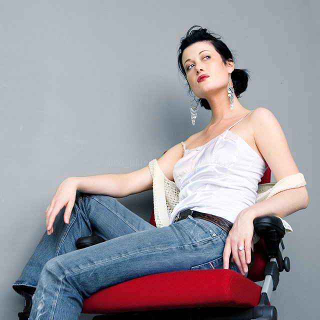
I guess there's not much left to say for me... I personally think that the clash of noble coolness and the pale skin of the model clash in a very punchy way with that ill-fitting office chair. Without it, there wouldn't be enough color in the picture - at least for the more narrow minded DPCers around.
I like the casual, relaxed looking but probably terribly uncomfortable pose, the well lit model and the equally well but not too evenly lit background and the fine details like the pieces of jewelry and the very subtle but effective make-up.
Over all, in my book, a great portrait that certainly deserves the average vote it got, if not more.
In many ways a very average picture, but a striking POV. I wish the post processing were a little "richer", it feels somewhat washed out to me, like half a stop too bright overall.
Beautiful model, good concept, but for me, the bright red "industrial looking" chair clashes with the casually soft sensuallity of the model. I would love to have seen her draped over chair that was a bit "classier". That being said, I must take into account the possiblity that this more industrial look was actually what you were going for, and if that is the case, then it is pretty well done. The lighting is a bit bright for my taste in this instance, but the composition feels right, the model seems at ease, and the shot looks like a contemporary ad. This might be a good stock shot.
I like the bright red chair for contrast against the faded jeans and gray background. Unfortuantely, my eyes are drawn to the very large earrings which I find kind of distracting, but overall I think you did well. Good luck in the challenege.
Like how the red lipstick matches with the chair to add dramatic interest to an overall well-made shot. The plastic handle of the chair spoils the elegance of the shot a little but maybe it was the only thing available.
a very classic looking picture just I feel that you cropped too close on the bottom. I think seeing her feet would have been nice. Kinda of compleated the picture.
Great one Nico, looks like a magazine but of course still fits the challenge perfectly. :-)
Something bothers me about the chair, it seems a bit too cropped off with her foot there. I'd say leave a bit more in or crop right up to her hand and closer to her head at the top. Good luck sister.
Normally I don't care for the eyes to be turned that far away, but it works in this case. This could come from a magazine. Very glamorous. You might want to move her out a little from the backdrop if you don't want the shadow.
Has a very nice fashion feel to it. Nice pose, elegant and I like her aloof expression. The contrasts betwen the casual attire and the jewelry and her attitude is nice. Colors are good and lighting is nice (although the slight shadow is a wee bit of an distraction) But overall a cool fashion portrait. 8






 Add photograph to your favorites
 Add photographer to your favorites

 Photographer found comment helpful.


