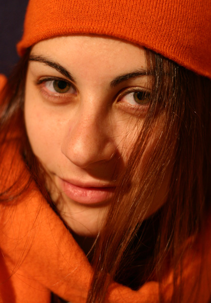
this looks great. i love the colours and her expression. the composition works really well too. wonder why it didn't do better. i LIKE the warm tone that's blending her skin together with her coat. it goes really well with the colour of her eyes.
Focus seems a bit soft. I would like to see a more sharp focus on the eyes and face. Oddly enough, the focus seems right now to be sitting on the hat. Very nice detail in the hat, and I wish that detail was in the face as well. I like the texture of the hat, but having it in focus, when the face is not, is distracting from the face, which should really be the focal point of a portrait. Does that make sense?
I like the orange clothes and hat, I think it makes nice contrast against the small portion of background that we can see, however, something is making her face look orange too. don't know if it's color balance, did you up the saturation? Having no photographers details submitted, it's difficult to know what you did, why you did it, and what you were trying to achieve. I can only offer my personal opinion that I think I would have toned down her skin as to not give it such an orange look. This is advanced editing challenge and you could have used layers to bring out the oranges in her clothes, and give her a more natural color to her skin.
Lighting appears ok, although I wish her eyes were lit a bit more. They are quite dark and don't even have reflection or catchlight or anything. I would prefer to see some sparkle in her eyes. Maybe even just a fill flash (not harsh) or lamp in front of her at a distance would have helped.
~Heather~
I like the tight closeup. On my monitor though, all that orange is casting her face towards orange as well. (Hmmm...Syracuse Orangeman or OSU fan?) :-)
The Bright Orange is outstanding against the dark background, but the White Balance seems to be off a touch, as the model's skin looks a tad yellow. Nice composition. <7>






 Add photograph to your favorites
 Add photographer to your favorites


 Photographer found comment helpful.


