*Critique Club*
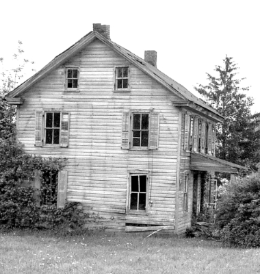
This house is leaning quite a bit to the right. If this was done intentionally, I don't think it's appealing at all. I think that it should be rotated back to the left and leveled. This isn't tilted enough to be considered "dramatic angle" or anything, it simply looks like an error.
I think that black and white works well for this old house, however, theres quite a bit too much white and not enough black. Maybe a midtone adjustment could help? Without making the whole shot look grey, just bump up the darkness, like in the windows and trees. Then again, it could just be the blaring white boring sky that is overwhelming this shot with white.
The house itself is interesting. Your focus and clarity of the house seems good. I like the detail in the siding and windows. I think you captured that aspect very well. I like how you used a older run down house for your image rather than a modern day, techno house.
~Heather~
there is an odd tilt on the shot that i'm not sure is the actual lines of the house and ground. I find the shot a bit bright, but lacking in enough contrast. I like the composition, but I wish the photographer was toward the right a bit more. :)
5. Fits the theme well enough, and there are no blatant 'you suck!' flaws to it, but neither does it really grab me for any reason at all. For reasons of composition, cropping, or subject choice, it's just a photo, and doesn't do especially much for me, aesthetically.
The tilt to the house in particular is mildly disturbing (perhaps on purpose). I don't find the very-white-ness of the whole to be a detracting feature, interestingly.
The house is a little crooked in the picture. Looks like a good fixer upper.
I would have cropped out more of the sky and added a little contrast to it.





 Add photograph to your favorites
 Add photographer to your favorites

 Photographer found comment helpful.


