*Critique Club*
Well, believe it or not, I can find one thing that I would like to have seen differently.
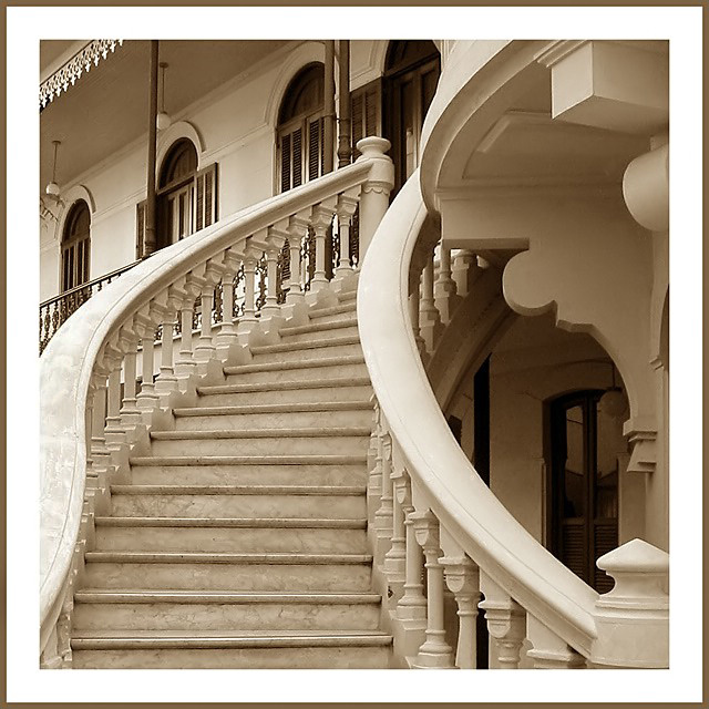
I do not know if it is the actual way it's made, or if the lighting is washing it out, but I wish that the marbled look of the stairs and left hand rail were also on the right hand railing. The left one looks like it has a pattern on it, which looks like marbling, however, the right handrail is smoothe and plain white. Actually, the way it is, the left one almost just looks dirty, like it's got dusty fingerprints all over it.
Anyway, having said that, on to the praise...
The angle and framing/cropping is great. I like how you have cropped it as if we were walking up the stairs ourselves. You cropped a tiny piece of the pyrimid thing in the lower right corner, but it doesn't hurt the photo at all.
The focus and clarity are great as well. I like the detail in the steps, and also the detail we can see at the top of the steps. I don't think a blurred background would have worked very nicely here. Good choice.
Lighting looks very well. It's a nice full lighting, which almost gives the impression of natural light?? I think it really works to have this in sepia like tones. In combination with the warm lighting, I think it looks really great this way.
The border looks really great with the shot as well.
Not much more I can say, but excellent shot!
~Heather~
In fact I have never lived in this house. It was built in 1912 and has an ecletic architecture. It was abandoned for many decades and was recently rebuilt and restaured into a cultural center. It's called Figner House. When I was a child, I used to play in their garden, it was very close to my place. That's why I named my pic "My old sweet home". Thank you very much for your criticism and comments.
Congratulations on your ribbon! This is a wonderful shot and only one of two that I gave a 10 to. Their is much here for the eye to feast on...the shapes, tones and architecture are all very interesting to look at and the focus and exposure are right on. Also, I think your use of this style and color border adds alot of class to an already very classy photo. Much luck in future challenges, although I don't really think you need it.
If this is your home then I'm after an invite. Great shot with superb lighting, composition and use of sepia which adds much atmosphere. The shapes created by this position are very aesthetically pleasing.
Love the composition and color (would have made a good duotone entry as well). Very nice exposure... I bet you have a very nice camera. Great job! Hey, you should have titled this: Stairway to Haven
One of my favourites this week. Great composition and the sepia tone is perfect. So is focus and cropping. I don´t know how you could have done it much better. Meets the challenge very well. Well done and good luck!






 My old sweet home
 Add photograph to your favorites
 Add photographer to your favorites

 Photographer found comment helpful.


