Author Thread
Post actions
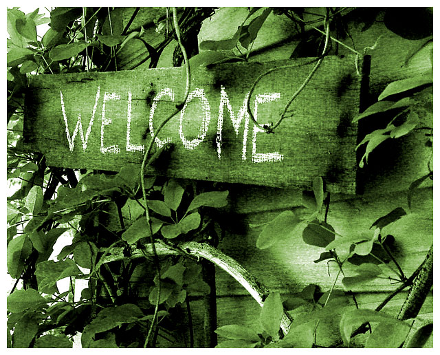
This almost has a sort of a fantasy feel to it, like Wizard of Oz or something. I expect to see a little leprechaun pop out under the sign.
Post actions
I love the tones here. You did good.
Post actions
I liked the photo more each time I looked at it. I gave it a 9, should have given it a 10. Loved the green!
Comments Made During the Challenge
Post actions
Why green?? Hurts the photo IMO.
Post actions
Good chioce of color tone for this picture.
Post actions
this is really great. its almost not welcoming because of all the overgrowth. Nice work with the duotone greens too. :)
Post actions
Sign looks old - writing looks fresh. Has their been some decorating recently? Nice composition.
Post actions
great duotone. great focus and slightly grainy look. love the chalk writing.
Post actions
Post actions
Would have made an excellent duotone shot as well this week. Solid 8 from me - wishing that the two branches didn't cover the sign, but that's ok.
Post actions
As I glanced through the thumbnails, which I do before I actually sit down and vote, this one popped out at me. I thought, "How odd; it's so green." And then I thought, "I really like that it's so green." Nicey.
Post actions
Good pic. I likethe way the leaves and vines wrap around the sign and make the image have value and more interest. I also like the green color because it goes well with the vines and branches in the image.
Post actions
Beautiful work. The composition and tones really are strong. 10 -danny
Post actions
great homely image. I like the green cast a lot.
Post actions
Was that text part of the origional photo?
Post actions
This is gorgeous. I love the color. 10
Post actions
I like this. The green sepia was a good choice.
Post actions
Wow - the green is fantastic. This picture almost looks spooky. It's intruiging and I keep returning to it. I hope you do well - it's one of my favorites!
Post actions







 Add photograph to your favorites
 Add photographer to your favorites


 Photographer found comment helpful.


