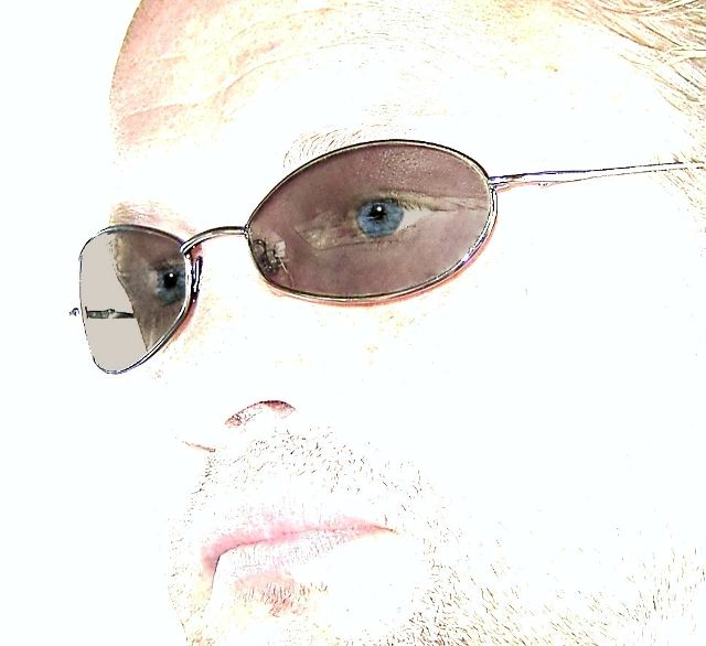
Self portrait - I'm not fond of these, but it's not always easy getting a model! I happened to be wearing a denim shirt that day and it matched the color of my eyes fairly closely, so I thought I might as well give the Portrait challenge a go.
I readily admit that I'm NOT skilled at photographing people, but this will help me get better (I hope). I decided at the last minute to change my entry to a more high key shot taken earlier that day (one from inside the car). Hand-held in my car at about 3pm - no flash.
PP included:
reduce backlighting
change hue
contrast
color sat
tint brush
blend brush
clone brush
selective layers of tint brush, clone brush, burn/dodge brush, gaussian blur, sharpen
crop
save for web
I'm starting to take my own advice again with this shot - I am really happy with it, so regardless of my score (and I really mean it this time - LOL, right!), I'm satisfied. I feel like I've improved over the last set of self-portrait images I took (although they were completely different than this type of shot), so it's all gravy now. I must admit that I hope you like it too! ;-)
Statistics
Place: 271 out of 284 Avg (all users): 3.9493 Avg (commenters): 4.3913 Avg (participants): 3.6383 Avg (non-participants): 4.2323 Views since voting: 1093 Views during voting: 446 Votes: 296 Comments: 26 Favorites: 0
On first glance, this photo really stands out. It has some very good potential. The way you used the sunglasses almost as a filter to give the eyes the normal exposure while blowing out the rest of the face is a great technique. The eyes themselves have come out very good.
In saying that however, it falls short of becoming a good photo. Here are some suggestions that may help:
1. Polarizer Filter: The eyes as I said before are fantastic, but the reflections off of the sunglasses really ruin their impact. While they should be nice and clear, both eyes suffer from something reflecting right in the middle of them. A polarizer would remove this reflection and give them added impact. It would also allow the color of the eyes to come out a little stronger.
2. Exposure: While I appreciate what you've done with this, a couple of things would help. First the lips. If you added a little lipstick (I know, you're a guy) to make them darker to start off with, they wouldn't be quite as washed out in the final. Second is the forehead portion to the top left. Most of the face is left without any details, but then the forehead in the top left produces a fairly dark (respectively speaking) section that is disjointed from the rest of the face, which produces another focal point which then detracts from the real focus of the eyes. Dodge it out or clone it out, so that it matches the rest of the 'missing' left side of the face.
3. Facial hair: I've read the comments that others have said, and I must say that I personally think the facial hair helps to give it more texture. However, it needs to have a more defined shape to the beard or a little more to fill it in. Also, it does seem to add some focus to the nasal hairs in your nostrils which is not a good thing. The hair to the left of the mouth (as we are looking at it) gives your face a little bit of a 'chipmunk' look as we have no other dimensions to the face except that little bit of facial hair.
All in all, this was a very creative take on the challenge. However, I think that this being a "Color Portrait" challenge and by removing almost all of the color from your face in the overexposure really hurt the score overall.
I did not vote in the challenge, but if I had, I would have scored this a 5. With the polarizer in place to remove the reflections, may have been bumped up to a 6.
Feel free to PM me with any questions you might have.
Though I am a big fan of high-key shots, I don't care for this one. I would love to have seen this as a more straightforward portrait. It's a nice tight crop, and the composition isn't bad, though I think I would have cropped even farther in on the right side.
This has almost an invisible man feel to it. I find the areas of red tones very "off-putting", and it seems kind of weird to see all those hairs floating around in space without really looking like they are attached to a face.
i think its burnt out a little too much. i like the idea, i just think it looks a little odd how we can still see skin colour where the sunglasses are. i think that should have been blown out a bit as well and just the eye be in "colour". also, the effect looks "clippy" in the sense that you can see where you went over in photoshop and selected the edges of the glasses, which makes it feel unnatural. perhaps using a dithering technique wouldn't make the glasses look so choppy (especially on the left lens).
Too much lighting on this image Jimmy :( I'm not certain if you're going for a high key effect on this one because the hair and your beard are almost gone. I think your outtake was way better. As I said, "You sexy bitch" :)
My self portrait on the other hand... EW! Great job Jimmy!
A very interesting idea, and probably very hard to do well. Unfortunately, yours ends up looking way over-processed. Not saying it is, it just somehow doesn't look "naturally" bright.
I like this because the processing is unique. My only suggestion would be to be aware of what will reflect on the glasses. I see some disturbing lines there. Other than that it's a great high key shot with a difference. I like the idea of the eyes and glasses being darker.
Interesting idea to expose for the sunglasses. Although I'd be lying if I said I found this shot aesthetically pleasing (purely because of all the blown highlights) - 6 for your original take, though. Nice thinking.
Great idea, maybe a bit more burning in of the mouth area? The reflection in the glasses, not too sure if it is a softbox or something, spoils it. If the eyes had been in sharper focus with no reflection in the glasses it would have had a lot more impact
Hmm not sure what to make of this one. Not visually appealing on the whole because of the washout, but you gotta love the attention to those cool glasses.
I like the style here. This style was dangerous, it will either make or break you. I bet the people that like it love it, and the people that don't like it, hate it. I love it, so GL.
A very interesting image. The visual weight is almost exclusively the eyes. For me, and I have to think that negative response is what you may be expecting, the high key is so strong that there is nothing to look at except the eyes. The image becomes static for me because there is nothing else to explore in the image. Kudos for trying something original, and without having seen all the images yet, I bet yours will be one of the most unique. JMO.





 Add photograph to your favorites
 Add photographer to your favorites

 Photographer found comment helpful.


