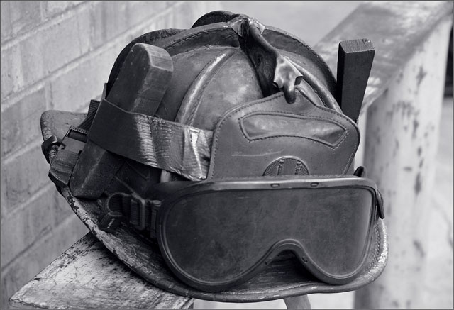
That is quite an interesting helmet. I think the helmet could be a little more sharp and the background a little more blurred. And also I think you should move the helmet more to the side or something; I don't really like things in the middle and there's not exactly a distinguishable focal point.
This would be great if you really punched up the contrast ALOT. AS it is, it just kind of stays in the midrange of grays and isn't overly interesting. I'm not certain of the meaning of the title, but I"m sure it is significant to you.






 Add photograph to your favorites
 Add photographer to your favorites


 Photographer found comment helpful.

