*Critique Club*
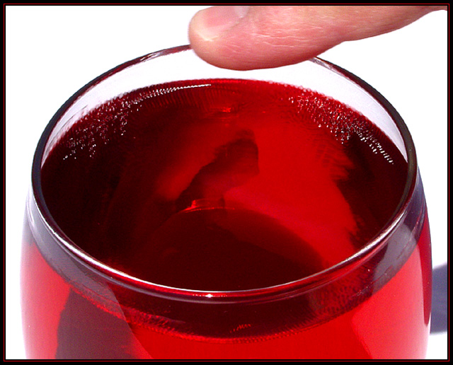
I like how we can see the ripples in the liquid in the glass. I DON'T like how we can see shadows in the liquid, especially the one that looks like a man creeping from the right to the left of the inside of the glass. Also, there is a shadow outside the glass to the right.
Focus seems a bit soft throughout. The finger is soft, the edge of the glass is soft, and the ripples in the liquid are soft. I do wish that at least the edge of the glass were in focus.
The background works very nicely here. The white creates no distractions from you image, other than the shadow created by your hand.
The angle and framing/cropping are ok. I like the closeness of the shot. I think that was important for showing the ripples in the liquid. Yo have centered the glass in the frame, which works for me here. I'm not sure if I'd like more of the finger showing or not. The crop there seems to be a bit tight, but not sure if showing more would help.
I think it would help though if the finger were in focus too. probably hard to do and get the ripples captured properly though.
Overall good, and it does portray some kind of sound.
~Heather~
the sound in this is clear, but not overpowering. I like the colour of the liquid and the movement of the juice. Not fond of the nondescript shadows reflecting through the glass. Still, very nicely done.
I like the concept and effects of your work. what bothers me is the brite light and glare.
If those two were right I woulg have gave you a ten. currently I give you a 6
cool, at least im not the only person that does this. My wife goes nuts when I do this at dinner lol I really like the color and the idea. It really shows sound to me. Gave it an 8
I assume either running your finger along the glass or tapping it because of the title, but without the title I would never have tied this to the topic. The finger may be required to establish the topic (however loosely) but it looks very out of place as is.
10 for concept, 8 for execution: 9 overall. :-> I hear the photo (which is my major grading criteria for this contest), and it's an appealing image overall. Good colors, good focus (esp. on the vibrations near the glass), but something about it just doesn't 'pop' for me and push it higher.





 Add photograph to your favorites
 Add photographer to your favorites

 Photographer found comment helpful.


