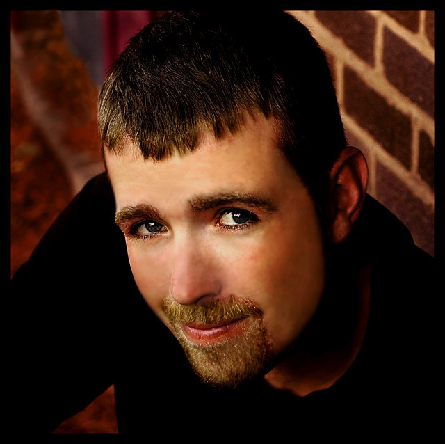
Not really happy with this shot,also had trouble with it looking diffrent on DPC, but was a great learning experience for me. I had a lot of help from my model husband who picked this shot. I hope he brings me luck!!
Statistics
Place: 83 out of 284 Avg (all users): 5.7612 Avg (commenters): 5.8889 Avg (participants): 5.5368 Avg (non-participants): 5.9608 Views since voting: 1173 Views during voting: 439 Votes: 289 Comments: 32 Favorites: 0
This seems really overprocessed. It looks like you added a lot of sharpening and blurred the skin and then overused neatimage. I see where you were trying to go with this but it just feels too overprocessed.
I think this is one of your best portrait shots so far. I didnt get a chance to vote but if i had i would have given this a easy 9. only thing i see that i dont care for is the cheeks and forehead are a bit too smooth( i think this is a neat image process overdone a bit) and he does have some wonderful eyes. another great photo :o)~~Cher~~
WOW! Hubba, Hubba! Oh wait, just read your comments, sorry, Hubby, Hubby! ;)
This is a wonderful shot, I loved it in the thumbnails and I love it in full size. His expression, those eyes! Great capture!
About the only things I can see that might make this a better shot for me personally would be a tighter crop on the bottom, you cropped or shot right at the top of his head and left all that space under his chin. I'm funny about balance on stuff like that, I like negative space when used with the rule of thirds but that's not in play here that I can see.
Also, the only thing I see as a bit of a distraction is the background. A more solid backdrop or just the brick would be better to me. Again, these are all just personal things that I like. :)
Love the pose and lighting. Eyes look a tad oversharpened, and the skin is blurred too much in some areas especially over the right eyebrow, but the rest of the photo is excellent. Good pose for a man.
A decent photo to say the least but the touch-up work in the face makes it look a bit over-processed where the skin meets more detailed areas in the hair, eyebrows, and goatee.
i think you've used a bit too much blur effect around the nose, as it looks unnaturally wispy. also, eyes need more lighting to really pick out the colour. they seem to be a bit too dark, especially in comparison with the black sweater. colour also seems to be a little "odd", almost as though he is wearing makeup/glamour shot-like.
I'm not sure but it looks like there was some additional blurring/softening or something in the post processing around the nose, cheeks and forehead that is IMHO, overdone.
Your right, he does have dreamy eyes! Lovely warm color tonings throughout the photograph. It does look to me like the neat image was a little overdone but it doesnt really detract from the photograph. Good Luck in the challenge!
My only problem with this photo is the background. The brick isn't bad but the BG on the left is distracting. I like the angle of his chin and the angle of the shot. Very natural and nicely composed shot.
This picture started as a very good potrait. Composition and lighting are very good. However, I detect heavy spot editing on cheeks and nose that makes skin texture looking weird.
Good looking guy you got here... Love the angle of the shot and the lighting...almost to much neatimage used though..makes it look like a young boy, which he isn't..This would make a fine portrait for a wall. Good luck.





 Add photograph to your favorites
 Add photographer to your favorites

 Photographer found comment helpful.


