*Critique Club*
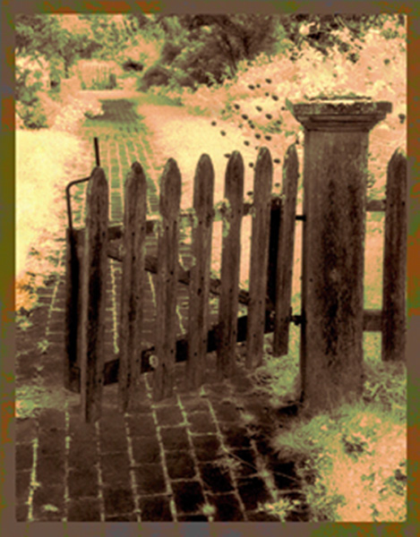
By saying "Digitally colored black and white photo" this makes me think that this was illegally done. The site council voted to request proof, but I don't think the results of this proof was ever passed on to us SC members by the admin.
I can say that it does not appeal much to me at all. I don't like the pink/yellow/green mixture. I think had this stayed a black and white photo, and had the focus been much sharper, this would have looked a lot better in my opinion.
The fence is really blurry, and there is no detail at all in the trees and bushes.
weather this was legal or not, the coloring is aweful and combined with this lack of focus, really ruins it.
My suggestion? Try just the black and white, and use sharper focus.
The photo with the fence, brick walkway, and trees looks like it COULD have been appealing had a different technique been used. The angle and framing/cropping on the fence is good.
I'd like to how you achieved thie effect, and what steps were used.
~Heather~
I like the painterly effect on this photo. Only suggestion would be to move the post either up a little or down a little so it's not quite so centered vertically.
This appears to me to have a lot of post processing to cover up some focus/technical issues. Sorry, it just doesn't appeal to me, though I think the basic subject is interesting. maybe without the radioactive grass and stuff it would be okay.
I like very much the light effect here and the colors. Remember me an Impressionist painting. I think it would be better if you move the levels before frame it... anyway, I think it is very creative
5. Fits the theme well enough, and there are no blatant 'you suck!' flaws to it, but neither does it really grab me for any reason at all. For reasons of composition, cropping, or subject choice, it's just a photo, and doesn't do especially much for me, aesthetically.
I could have graded this much higher if it weren't so pixelated and overprocessed; the basic subject choice is quite appealing to me (if lit similarly, shot similarly, and left crisp, with perhaps a softer focus on everything past the fence).
I think the composition here is nice... the post processing you chose seems to ruin my opinion of it though... I guess it's just my personal preference... = 3







 Add photograph to your favorites
 Add photographer to your favorites


 Photographer found comment helpful.


