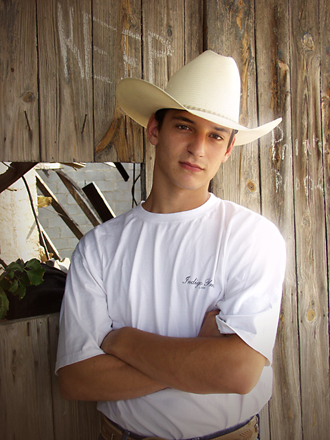
Greetings from the Critique Club!! I really do like this portrait. The Subject is nicely composed, the background is well suited, and the lighting on his face is very nice. The white shirt and hat really allow his face to be the primary focus. As the comments mentioned, there is a "hot spot" on his right shoulder. Sometimes this can be fixed using dodge and burn. One thing that might have made him stand out even more would be to sharpen him and make the background less sharp. Overall, a very nice portrait, extremely well done.
~SiSi
The background takes so much away from what is otherwise a really nice portrait. Too many distracting elements taking my eyes away from the model. Lighting and exposure are well done.
I really like how natural this photograph looks. The only thing I could possibly suggest is perhaps to crop it a bit tighter. Nice Work! Good Luck in the challenge!
I really love this portrait. The background hole in the wall is a bit distracting but the graffiti on the wall gives it personality. I wonder how this would look if you had moved him away from the hole and just used the wood as a background?






 Add photograph to your favorites
 Add photographer to your favorites

 Photographer found comment helpful.


