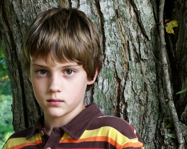
This is a good portrait of your nephew. I do think you got 'him' almost exactly right. The eyes are bright and wide, focused and sharp. Skin tone is right on, with just enough softness to be smooth without plasticky feeling. Hair has great detail as well. The colors in his shirt also work well with his hair and eyes, good coordination with that.
Now to look for areas that could be improved on. Most of these have been mentioned in others comments.
1. Background/Subject: The way the photo is, there is a seeming competition between the subject (your nephew) and the background. While the boy is fantastic, the background being so sharp makes us want to look at it more than the boy. The detail in it is fascinating, including the leaf. In fact, take away the boy, and you will still have an interesting photo. This shouldn't be if this is really a color portrait.
2. Depth of Field: I think the DOF could be moved toward the camera just a little bit. This would give his chin and lips a little more sharpness to remove the sense of blurriness there. It would also blur the tree into the background a little more so it wouldn't be in as much competition with the subject.
3. Pose: Look at the line of his shoulders. Because of the way he is positioned, the shoulders slope out to the left and down. This gives the closer one a feel of being out of proportion with the rest of his body. It also leads the eyes out of the picture. A slight change in pose turning his body more toward the camera and moving him a little forward from the tree may help with this.
Overall Impression: I did not vote in this challenge, but had I voted, I would have scored this a 6. If the tree was not in such competition with the subject, would be bumped up to a 7.
If you have any questions about this critique, feel free to PM me.
What a great capture. I like the backgroung here and the darkened part of it on the right side. Somehow it matches his expression and the mood of the photo... The left side of the tree is a bit distracting however so I might have tried cropping that out? But good lighting on the face, it has depth and the eyes are easy to focus on! well done!
There is more detail in the tree trunk than in Ryan's eyes, which is not desirable for a portrait. However the composition, lighting and expression are very good.
One of the better child portaits in this challenge. I love the tree being in focus, although he is softer focused, but somehow it works in this instance. He has great eyes and an expressive face. Nice.
This is a stunningly natural shot. I love the contrast between the boy and the bark of the tree behind him. I think this is a wonderful shot for framing and placing on the wall to be admired! Well Done!
Nice shot. I really like the composition. The longer I lk at this, the more it looks to me that focus is stronger on the tree trunk than on the boys eyes.






 Add photograph to your favorites
 Add photographer to your favorites

 Photographer found comment helpful.


