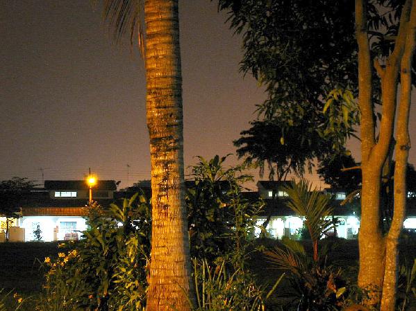
I think the tree smack dab in the middle of the picture is not a good thing. All it does is split it up into two not great pictures. There are basic shapes of homes with blown out interiors. Nothing really dominant in the picture to focus on.
I really love your perspective on this. Very original, and yet undisputably fits the challenge. I love the tones you've capture on the treesd. I do wish the building lights weren't so bright, I want to know where we wish to belong.
5. Fits the theme well enough, and there are no blatant 'you suck!' flaws to it, but neither does it really grab me for any reason at all. For reasons of composition, cropping, or subject choice, it's just a photo, and doesn't do especially much for me, aesthetically.
The similarity of color of tree and sky tends to make the trunks and the glow blend into each other, strangely, and the overbright under-the-overhang areas both rivet the attention and then shove you away with their lack fo detail. IF it were about either of the trees, framed to put them in the center, compositionally, it might be a more interesting shot. If it were about either of the houses, likewise a different framing would have worked better.




 Add photograph to your favorites
 Add photographer to your favorites


 Photographer found comment helpful.


