*Critique Club*
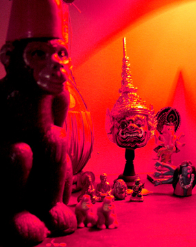
I'm tossed on the lighting here. On one hand, I think that it adds some dramatic effect, on the other though, I think it's quite too strong and ruins a lot of the detail we could have seen here.
I think my final decision is that it is negative to the photo.
You have chosen a nice angle to shoot these things. It's not too busy, and it does say something about yout home.
However, the red light takes away a lot of detail. It's too overpowering, and actually erases things out of the photo. See the 2 little objects at the feet of the monkey to the left? They are only litle blobs, we can't see through the powerful color to even get a shape out of them.
The focus looks like it's in the far back on the head wearing the pointy hat. This looks to be the sharpest focus. The monkey to the left is not well focused at all. And that also hurts any details we could get here.
Can you tell I'm a fan of detail? lol
Anyway, I think it fits the challenge nicely, and the colors work nicely on the background, however, not on the objects themselves.
~Heather~
The pumped saturation is, for me, kind of distracting, but that's a personal choice. If it accentuated the composition or helped direct the eye, it might not detract from my vote; but as it is, combined with the utter lack of focus anywhere in the frame, 4.
I find the colors a little too saturated so much that they obsucre the interesting objects in the scene, but I like this photo and think it's very interesting. to look at. It's got an exotic look
Interesting pieces, but the color saturation seems overly heavy. Strong color, but it overpowers the elements of the photo. The set up doesn't seem condusive to the elements, too (too random). 6 Rob the Swash





 Add photograph to your favorites
 Add photographer to your favorites

 Photographer found comment helpful.


