Thanks for your comment's on my picture, I didn't think it was all that great, but certainly better than it's overall score turned out.
(this is written as a devil's advocate, hope you don't mind.)
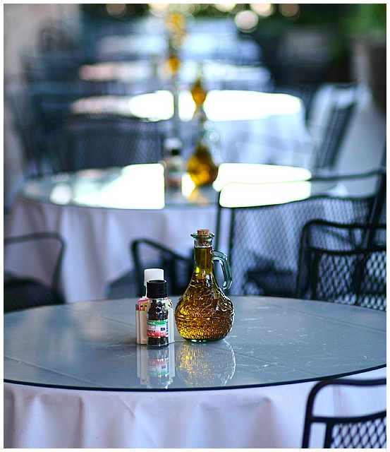
I think this picture suffers from not enough subjust, or an unclear supject.
As I've (hopefully) been learning from the thirds challenge, I think placing the olive oil and condiments (which appears to my eyes as the subjest) larger and off center in thirds, with the other table settings leading off to the top/side/corner would have helped. This would bring your eyes to the detail on the bottle more, and help to lead you eye to it.
I also think this composition would work better with deepre DOF, with at least the next table in focus also.
Also, to be REALLY picky, the table needs to be cleaned. :0)
I've looked through some of you other stuff, and it show that you have a ton more potential than that which showed up in this picture. Keep at it.
Didn`t get time to vote in this challenge..but if I had, then this would have received a very high score...I love it.
The DOF is just perfect for my taste and the blown highlights add to the impact of the pic (for me).
Definitely should have been in the top ten.
Very nicely done.
Sweet use of depth of field here. Superbly composed. Don't let people tell you that you've got blown highlights on the tabletops. It looks great. Thanks for sharing this beautiful image.
Very cool idea. Nice composition. I like the shallow dof here, but I'm thinking maybe it is just a little bit too shallow. If there was still the blur, but a little more definition to the background tables, it might strengthen the presentation here.





 Add photograph to your favorites
 Add photographer to your favorites


 Photographer found comment helpful.


