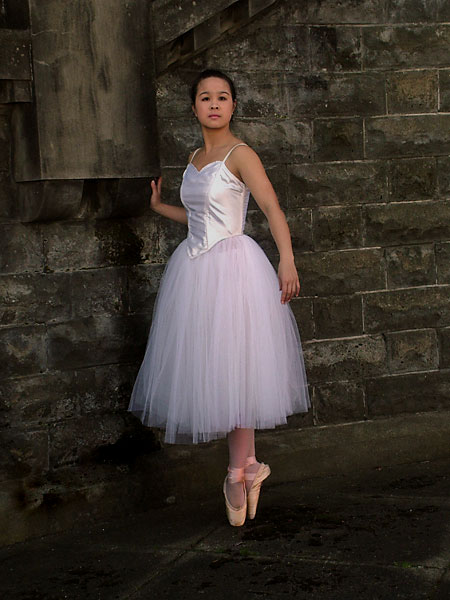
I wonder how this would look if it were cropped in a bit more from the right hand side? This would take the subject out of the center, which for me, makes photos a bit more interesting. I do like how she has a pretty white tutu against the dirty, gritty background.
The subject is too central. There is too much space around her and I'm not getting a good look at her. I like the idea of a somewhat out of place ballerina. A tighter crop and slightly different composition with hernot in the center would have amde for a very nice image. 5
nice picture, but needs more light brought into the subjects face. i think this shot might be downgraded for not cropping tightly around her face, which isn't necessarily a requirement, but i think for this to be considered a portrait, you need to really highlight the model's face. currently, i think her eyes are too dark and just sink into her face, removing any expression that could have been interpreted. a shame, because the background is lovely, and the model has a lot of potential. I'd try to reshoot this with a light reflector to get some more natural lighting. 5/10
I love the pose. I wish it were a little closer to the subject to reveal more of her face. I also am unsure about the background, it seems so noncongruous with a ballerina. I like it and I don't like it...7
Nice contrast of the gracefulness of the dancer with the harsh "industrial" appearance of the background. A little different of a crop would've pleased me more but nicely done shot.
I like the softness of her en pointe with the tutu against the craggy concrete floor and stone wall. I wish she were larger in the shot so I could concentrate on her pretty face. This is more of an entire body shot than what I think of as a true portrait. Still, it is very well shot and you did a good job. 7







 Add photograph to your favorites
 Add photographer to your favorites


 Photographer found comment helpful.


