Thanks to the stunning Olivia who let me take photos of her!
Editing went something as follows:
Unsharp Mask
Unsharp Mask
Brightness/contrast
Hue/sat
Dodge/burn
Resize
Unsharp Mask
Neatimage
After the votes:
WOW! This is so neat to be above a 7 and in the top 10! I'm so excited!
About the over processing:
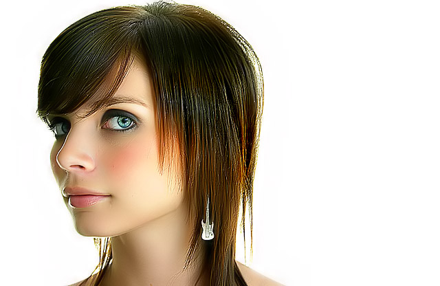
Olivia really is stunning so even the littlest bit of processing makes her over processed. Unfourtunatly it was my frist time with NeatImage and might've overdone it way too much. Then again, this is the kind of processing done on the front of magazine covers which she could easily grace someday.
Statistics
Place: 9 out of 284 Avg (all users): 7.0156 Avg (commenters): 7.9444 Avg (participants): 6.6897 Avg (non-participants): 7.2857 Views since voting: 8966 Views during voting: 805 Votes: 320 Comments: 110 Favorites: 35 (view)
this is really lovely.
a pretty face with a good photography skills.
like in your comments, she does appear a TINY bit over-processed, but I'm not disturbed by it at all. I think it looks great and has that CLEO magazine quality.
I think the processing done here lifts this image above the crowd. It's not just 'another portrait'. It creates a very unusual effect - a plastic 'baby doll' look as has been mentioned. I think this is 'overprocessed' even for the front page of a glamour magazine. I would put this as much more of a personal artistic endeavour which pushes the envelope to create something that is on the border between beautiful and disturbing.
The only issue I would raise is the fringing around the nose and lips from sharpening.
Other than that - well done Katherine. Do some more.
You really did a great job with this image. Although I did not vote this challenge, I did look (I always look :) and this was one of the images that stood out.
The good things:
Olivia's awesome features. Seriously, she has the look a professional model. Unusual and just a touch exotic with some truely striking features.
Non centered composition. It would have been so easy to plunk her into the center of the frame... but you didn't. Kudos on that choice.
Guitar earrings. Playful, and at the same time they echo the shape of her face and jawline.
The not so good:
Sharpness is a double edged sword here. She is SO sharp (oversharp, in fact) that it is impossible not to comment on it. Portrait work is often suited to a mix of both sharpness and softness. You want sharpness on specific features, such as the eyes and lips, with softness on the others.
Whether you actually used NI or other noise reduction or not, it sure looks like you did, and just a little too much of it too. Much of the natural "grain" of her features has been wiped away. It's an interesting effect, but disturbing to many, myself included.
Overall you did a fablulous job with this image. Like JM said, placing in the top 10 these days is no easy task. Congrats.
Hi NightShy... congratulations on a top ten finish :) That's a feat in itself these days.
Your model is beautiful and her eyes are intriguing. That's a very strong element in this portrait. The color and contrast are excellent as well. It's a very 'lively' representation of your subject. The way you have presented her offers a bit of intrigue as well as a very subtle feel of playfulness. Her earrings speak to me on an entirely different personal level, so I enjoyed seeing those as well.
There are two aspects of this image that I don't like, and you have already touched on one of them in your own comments. I personally do not care for the plastic babydoll look that the over use of neatimage creates. Some people love it and others do not, so you can see how subjective something like that can be. You are right about glamour magazines though. They do this sort of thing, and journalistic representations are of little concern. Their job is to make the model look good and there are really no rules to abide by. The second bit I don't like is the close proximity of the top of her head and the edge of the frame. In a situation like this, I would either provide more breathing room or cut off the top of her head enough where it appears to be intentional. (Keep in mind that I'm definitely no expert on portrait photography.. I do very little of it). To me, this appears to be accidental and indecisive. Subject proximity to the edges of the frame is something you will want to take control over.
When I first saw this I immediately thought of a character on one of the video games my son has played (don't ask me which one). The intro has really great character videos, halfway between a cartoon and a real photo that this looks just like. She is a spitting image of one of them. Over processed or not I think it is wonderfully modern shot. Great job.
this is not overprocessed, oversharpened or overneatimaged. It is borderline perfect. You are really becoming (already are) an amazing photographer. Wonderful.
Well, it's certainly a stylized look that some will like very much. I think it's really a love it or hate it type of thing. Obviously there's a lot of talent here both from the photography aspect and the post-processing. I however, don't like the fact that you've removed all of the detail from her skin. If you left a hint of it I think this rates even better. As is those without a camera seem to think this was really just a 50ish ranked photo as oppose to what the "experts" thought. Still great regardless.
this is not overprocessed, oversharpened or overneatimaged. It is borderline perfect. You are really becoming (already are) an amazing photographer. Wonderful.
This is perhaps the top image of this challenge. Yes, some shy away from the processing and may feel that neat image overtook the day, but this is not really so. It is only a knee jerk reaction. This image has all the qualities of a ribbon winner and should have so been rewarded as all post processing has been used to enhance the dainty beauty of this lovely subject. My warmest congratulations on your accomplishment and your top ten finish.
great lighting! and the makeup is also very good. one major flaw though, and i know you'll be hearing this a lot about this shot. way over-sharpened. but that's not a fault in your actual photography, the photography is perfect, just the post processing. so a major flaw with a minor fix. great shot though. i don't really know what else i can add. other than the fact that i have a friend named Olivia and i think that's the most beautiful name ever and that i now think that every girl named Olivia is beautiful. i'll add this one to my favourites because this is a great shot.
wow i want this picture to win. if only it wasn't so sharpened. if this picture doesn't win it's because it's oversharpened. i can't vote (im not a member), so i can't help your average up with a 10. but i think this photo should win
This is so slick wherein the post processing has produced a masterpiece. Great attention to detail and done to perfection. The guitar earrings makes it sing even louder. Facial feautures are of course a big plus and thry serve as the foundation to this blue ribbon quality image. 10
interesting. She really reminds me of ashley simpson for some reason.
either way, I really love this. great editing, but there are areas that seem a little oversharpened (like her hair, eye and under her eye) but besides that, this is truley wonderful. the earings are a nice touch aswell ;-)
Whatchu scorin now kate?
As I said before, always do the sharpening after the neat image, otherwise very studioish. I would like to see a bit of room above the head and a little more of her shoulders as well.
Pretty good though, I can't wait to see your finish!
I just noticed the earings :) Great composition and neutral background. I really like her looking sideways and the depth it gives the photo with her strong profile. Amazing focus on the eyes and great skin tones. The photo does seem just a tad oversharpned around the hair? Very well done!
I don't WANT tolike this very "palstic" looking rendition, but there's so much in it that compels... The rimlighting onnose and lips is very fine. The bone structure, the size of the eyes, she almost doesn't look real, a very striking model. I don't as a rule vote "for the model", the opposite in fact, but you've done quite a job of accentuating her gamin-like qualities.
Looks a bit over-photoshopped in places but this is damn near perfect. With those features, I would not be surprised if she holds still for photos for a living. Great hair and makeup, wonderfully lit, fantastic lines...and those lips...ohhh.
A very pretty girl who is either unreal or way over-produced. I like the shot and the pose. Also the glance of the eyes is great. When I saw the thumbnail, I thought this would be one of the top pics, but it's just too cleaned up. Her skin is too perfect. Forgive me for not expressing this well. I'm having trouble saying exactly what I see wrong, but want you to understand that I like it and have a problem with it at the same time.
Superb fashion photo that is gonna get placed very high in this challenge... The framing is good and the softness is maby tiny to much. But nothing to the whole...
Well done... 8
I don't know if I should love it or hate it.
It's different (in a good way)
I like her, and I like the look, ik like the softness I like the colors, but still there's something that I don't realy like, just cant seem to put my finger on it.
Still a higher than avaredge score
This is my favorite of the challenge - to my eye it is excellent lighting, composition, sharpness/focus - the eyes, skin, and hair all look fantastic. Good job and good luck!
Fantastic shot. The lack of any background color is great, but almost makes the image too perfect and a bit sterile feeling. Extremely good shot though!! Great job!!
This is really fantastic! My only very minor criticism is that it looks like something weird is happening with the pixels in her hair at the back of her head. Otherwise, perfect! 9
Nice, sharp as a tack. Personally I think too much post-processing, but your picture is not nearly the only one I've made that comment on. It's just a preference. The pose is nice and the background as well. 8
You know... I love this image... I really do... but... to me it looks like a computer generated image lacking the realness necessary to represent a true portraiture... in another challenge it would get a 9 at least... well done... :)
ok,... nice lighting and all. But she facing outsite the frame. I think if she is faching into the frame then the viewer get a better feeling, "Feeling about what is there, I want to look deeper into the frame"
I hope you understand me - 8
i like this shot a lot, and i am hardly one to criticize photographs, but i think the model looks a little too fake, mainly in the cheek area... it looks kinda like plastic... but the definition in hair and eyes is astounding...
Okay, that's just scary. Please tell me that's wax or plastic and not a fantastically smoothed human skin? Still a 6, because the lighting, composition, and expression are all very good (in fact, could have been a 10 with human looking skin)
I like the pose, the hair, the lighting, not much on the framing (facing out of the frame is kinda jarring). The main issue here is the extremely plastic look of the skin... I take a nose reduction program such as NeatImage was applied? Need to retain some skin detail for a natural look.
Beautiful model. Great composition. I love the eyes, and the hair, and the colors are outstandingly brilliant. This image should do very well. Good Luck. <9>
One of the last i am voting on. this one pops off the screen. Id like to find some small flaw to balance the praise, but I can find none, so I have to give it a one, because I hate people who are better than I am. OK you get the ten, you earned it here. if not blue then red.
Those eyes! Love the angle and compostiion. Nice makeup. Love the earings, as they add personality to the shot. Skin is over processed. Very nice image overall.
I love her expression, her eyes convey alot. I like the composition and the colors and lighting are good. Her skin is a little too smooth and hair a bit to sharp for my tastes, but that's just a personal taste. Overall, I think she's gorgeous and you photographed her well. 8
I am sure you got tons of comments on the plastic look. I am sure some like it and other don't. I am in the "don't" camp. That would have been a very good picture with an original and unusual composition, cute model and good lighting.
I still have a feeling it will finish close to the top here.
Very very nice but I don't like the plastic look of her skin. The model is absolutely beautiful and the pose .... just great. Maybe cropped a little too tight at the top.
Is this a doll? Her skin tones look really fake for some reason, but her eyes look real. Almost like its a mixture of a real person and a ceramic mask which is just sort of creepy to me. It's the right (her left) cheek that really strikes me as off. Also there appears to be some pixelation around the right (her left) eye. Overprocessed?
great negetive space.. i like when breaking the rules.. i bet some people said something about it.. i think its great as well as the skin tone and focus... my first 10







 Add photograph to your favorites
 Add photographer to your favorites

 Photographer found comment helpful.


