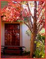
Of all the sort of run-down "fixer upper" interpretations of this challenge, I liked this one the best. It's very jigsaw puzzle-able in its crisp lines and bright colors. Definitely the best light that house will be shown in.... :)
Interesting subject. I think that your composition would be improved by changing the framing - either pulling back and adding a foreground subject or zooming in to capture some textured detail.
5. Fits the theme well enough, and there are no blatant 'you suck!' flaws to it, but neither does it really grab me for any reason at all. For reasons of composition, cropping, or subject choice, it's just a photo, and doesn't do especially much for me, aesthetically.
lighting is a bit bright in spots. I like your choice of subject but I would have come at it from an angle and taken this when the sun was going down. Nice color.







 Add photograph to your favorites
 Add photographer to your favorites


 Photographer found comment helpful.


