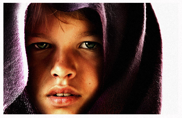
Let me start by saying this is a great portrait. I like the compositon an the landscape mode, it works well. I would have cropped the white part on the right as this make the image look off balance.
The blown highlights on the side or her face are very distracting, my eyes keep wandering there taking attention away from the subject. The loss of detail in the shadows are also a bit distracting.
I like the post processing. I have no idea what you did because you didn't provide any details but it works. The only thing I would try to fix there is the slightly blown nose. This obviously just my opinion and you did very well, keep it up.
If you have any questions or comments on this critique, please feel free to PM me.
Everything looks perfect except the blown out whites on this very intense portrait. (Also, the title doesn't fit her expression, she looks more bored than desperate.) Still, this has a strong impact.
Correction: I replaced the his wity a her and added an s before the he. Now I appologize... :o)
I really like the look you captured and the lighting effect is perfect for this image. Very nicely done. Definitely should be a top 3 finisher. Good luck!
I'm not sure that your title fits the expression in my opinion, but that's ok, cause I am not voting solely on my opinion or the title, although sometimes it does make me lean to the high side if its a good title. This is beautifully done. Easily a 10.
Very nice portrait. I like the expression and sharpness in the eyes. Pity the head covering is a bit overexposed on the left though. Good textures on the skin, and I love the grain.
There's definitely some intensity that's been captured here. The noise on the right isn't very appealing though, and given the dark mood of the picture, it might have been better with a darker background in place of the white on the right.
huh, i don't know what to make of this image. I don't like the white space to the right for sure. the lighting on the face is almost perfect. maybe I will return for further deliberation.
I like this. Good color, nice contrasting areas and composition. Good luck in the challenge....one of my first thoughts was a Jedi Knight in training. :-) 8
this will probably do very well with rthe voters here, this style seems to have quite a following, but There have been many in this genre in challenges of late. D&L being a point, I think they are getting a little like Anne Geddes images , after a while there is a same nesss about them. I Don't mean to be harsh or dis respect full but just to offer my personal opinion for what it is worth ,.8
I like the soft side of this rough and tumble boy. The purple is a nice color. Great skin tones and the eyes are piercing. Nice use of light. I like this alot.






 Add photograph to your favorites
 Add photographer to your favorites

 Photographer found comment helpful.


