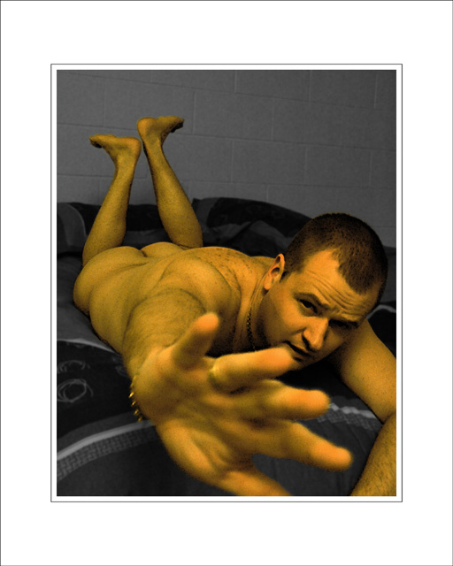
This sits in an 8x10 silver frame on a wood dresser the same colour tone as the body (err... yes it's me.) Surprisingly, everyone (including family!) who've seen it so far likes it. Hmmm.
It's quite fuzzy, over contrasted and very unnatural in colour. But as a piece of "art" people seem to like it. Not sure I do though (subject asside.)
I have a beautiful Parrot print with a watercolour effect (Photoshop) added. You can't tell it's not a "pure" photo from a distance, but up close it looks "crap" compared to how a photo "should" look. It looks *much* better with all the extra texture from the PS effect though. It's somehow brigher and more "real." I believe this is because the eye can't see the intricate detail of the features rendered as a pure photo. *Everyone* that visits comments on it.




 Add photograph to your favorites
 Add photographer to your favorites