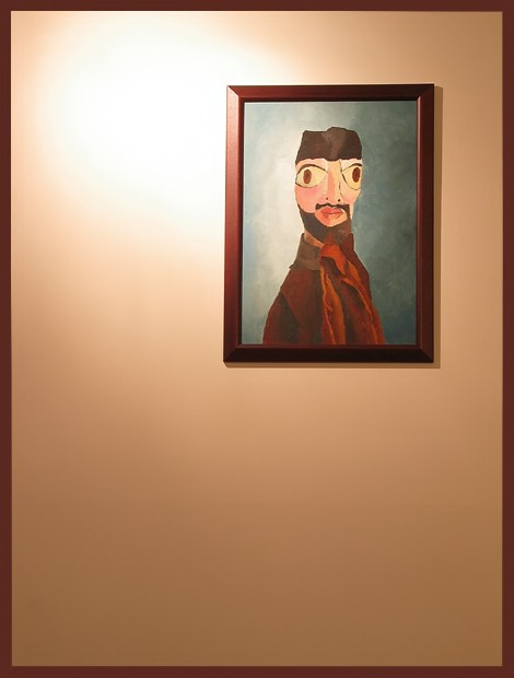
A painting by my mother I call "Gohar nabir" for strange reasons. This happens to one of two paintings that have made it to the walls since we moved in october 2002.
Statistics
Place: 108 out of 175 Avg (all users): 4.9130 Avg (commenters): 5.2353 Avg (participants): 4.8462 Avg (non-participants): 4.9655 Views since voting: 1172 Votes: 207 Comments: 18 Favorites: 0
The color and contrast of the painting and wall are good. Your focus appears to be pretty good too.
You have two problems with the entire image. First being the lighting glare, it left a big white spot that distracts from the painting itself. Secondly the big emptiness of the image There is nothing in the bottom half to look at. A floral arrangement on a table or a chair added to the left side of the image would have added something to it and balanced it out somewhat so you would be looking at something on the bottom instead of emptiness.
It does say Home to me so with that in mind it meets the challenge.
i like that the frames are the same color. you should have made them match perfectly with beveling, etc. (of course, that would be illegal, but it would look cool for later). nice job. is that your original painting? self portrait?
This is a pretty weird photo if you don't mind me saying so. I like the painting, but the photo involves more than that. I like the bright spot on the wall and the use of negative space to really accentuate the painting. We are forced to look at it. My feeling is that it will not do very well, but I think its better than average. I really think you made the most of this bit of wall and the painting. Good job
Like the way you've framed the photo in the same colour as the painting - very clever effect. However, the fact that the main interest in this shot is another picture isn't great - feels uncreative. But I do like the picture, so you save yourself with your taste in paintings :) Who's it by? Quirky.
Grat painting. Nice colors. I like the pure simpicity of this picture. Wish I had thought of it. The one distracting thing is the lighting. If you balance the lighting this would be perfect. A tiny bit sharper would be nice.





 Add photograph to your favorites
 Add photographer to your favorites

 Photographer found comment helpful.


