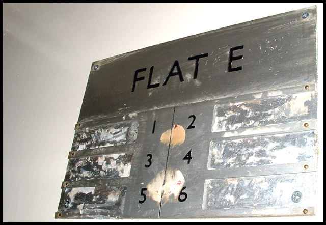
Interesting composition. I think your image might be improved by adjusting the lighting so that the lower right corner doesn't look so over-exposed. Take advantage of the 'texture' in the subject.
5. Fits the theme well enough, and there are no blatant 'you suck!' flaws to it, but neither does it really grab me for any reason at all. For reasons of composition, cropping, or subject choice, it's just a photo, and doesn't do especially much for me, aesthetically.
Industrial grunge, social comment, yes, but...
I would still expect a photo to stand on its own two legs two days after the challenge is over. The substance is just too thin for a good rating, IMO.







 Add photograph to your favorites
 Add photographer to your favorites


 Photographer found comment helpful.


