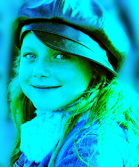
Isaac's classmate at school, reunited in the third grade for the first time since kindergarten.
Early morning sun made the lighting pretty harsh anyway, so since my first impression of her outfit was 60's retro, I went with the "wacky" colors as well.
@ Cropped
@ RGB curves, and separate channel curves to mess with the colors.
@ I think some USM
@ Rough selection of background areas, feathered, Gaussian Blur applied 2-3 times to isolate her face against the BG
@ SaveAs JPEG at quality 7/10 = 141kb
Statistics
Place: 278 out of 284 Avg (all users): 3.7661 Avg (commenters): 3.6923 Avg (participants): 3.3885 Avg (non-participants): 4.1026 Views since voting: 1229 Views during voting: 443 Votes: 295 Comments: 30 Favorites: 0
Thanks -- as I mentioned in my notes, her outfit and look made me think "Sixties" immediately, and was the inspiration for this.
While the pose/expression were great, the lighting and background circumstances were not. Since I was going to be making radical tone adjustments anyway, and since "color" was supposed to be the "point" of the challenge, I went ahead and tried to make it look like something you might see on one of the "Acid Rock" concert posters common in that era.
Greetings from the Critique Club!! Congrats on being brave enough to try something new! You really do have a wonderful subject to work with. About the blue/green, it is entirely a matter of opinion, some will love it, others will hate it. It does work very well will the way she is dressed and the title. As for your composition and focus, I like it. Looks like a fun way to "fix" a harshly lit picture. Good work and keep shooting!
~~SiSi
cute photo, great model and nice capture, but you make me work to see it. the post processing also brought out the noise. would love to see this in a more traditional treatment - 3
harsh on the eyes, way too much green and burnout. sure, that might have been the sixties look, but i'm not sure it was meant to be brought back into style just yet.
This is really neat. Basically I like the colors overall , but I find the yellow around her near eye to be distracting, it almost looks like a bad yellowish green rash. The composition is great and her expression is too. Wondering if the original version might have been even better.
Does that girl have one blue and one green eye? Would have liked to see that! Nice composition...why the heavy colour cast (I can see it was obviously done intentionally)? Ruins a great shot in my opinion. 5
I dont like this effect at all. I am not sure if you were trying to get a cross processed effect? Pity because she is a real cutie and I cant help but feel it would have been beautiful in its original form.
Sorry, I really dont like the blue in this photograph. (I am sure others will though) I do love the look on your models face though and think it would have been much better in a more natural way.








 Add photograph to your favorites
 Add photographer to your favorites


 Photographer found comment helpful.


