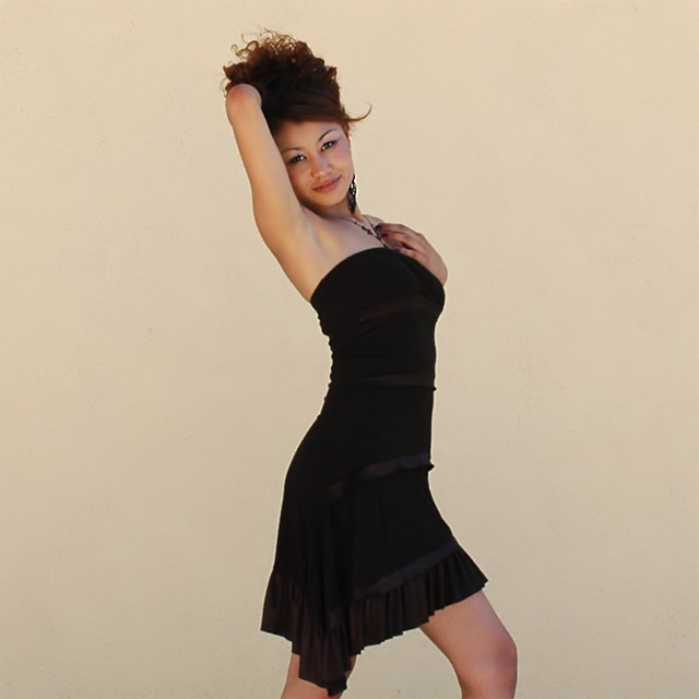
A friend of mine from El Salvador, convenient model in all my photographs with people. Shot at my old high school. At 4:15pm the sun was shining from slightly behind the wall leaving a shadow extending about five feet from the wall, which she was standing in. Nice ambient lighting from the wide area of concrete in front of her. I came up with a number of nice shots but I think people might find some of the lines distracting so I'm entering this cropped version. You can see the original photo here.
After receiving comments I realized that for a portrait this should have been cropped much tighter. I personally like the negative space and that is what I really liked about the original. Unfortunately, the original looks awful at a width of 640 pixels and it contains some lines I didn't think would score well.
Photoshop: cropped, tons of cloning in the face for blemishes (she's only human) and in the stucco where bicycle tire marks were, warming (81) photo filter layer, saturation layer at +15. Save for Web, NeatImage.
Statistics
Place: 129 out of 284 Avg (all users): 5.4358 Avg (commenters): 5.6190 Avg (participants): 5.1888 Avg (non-participants): 5.6667 Views since voting: 3907 Views during voting: 597 Votes: 296 Comments: 22 Favorites: 0
que senorita mas bella.. como que tiene un parecido a Selena, no? siento que la foto esta un poco fuera de foco y que el fondo necesita mas detalle..su pose tambien parece medio incomoda para ella.. espero ver mas de tus fotos de moda y estilo!
translation- what a pretty girl. she kindda looks like Selena. it seems the picture is a bit oof and that there should be something more interesting in the background her pose also looks somewhat uncomfortable for her. id like to see more of your fashion pictures.
Sexy, appealing, nice pose, but not an overwhelming amount of color. Although a very fine image, and one to be very proud of, I'm not sure it will stack up against some of the very fine work done in this challenge. However, I wish you the very best of luck. I hope it does well. I like it a lot. <7>
The bit that mainly portrays the character and personality (the face and specially the eyes) uses a minute portion of the frame. The background, however, which tells me nothing about the subject uses approx 70% of the frame. Technically very good though.
She is beautiful and such a natural in front of the camera. I really love this photo. I'm thinking it might even be stronger if she wasn't right in the middle of the photo but maybe cropped closer to the left. I love it anyway tho.
A lovely model and I like her pose and expression. One thing that I think might help this shot is to change up the composition a bit. I would either crop it to potrait orientation and have it be more about her and less about the wall, or I would put her off center to give it a little more interest. Having her dead center seems to take away from the photo a bit. It really should be all about her. :-)







 Add photograph to your favorites
 Add photographer to your favorites


 Photographer found comment helpful.


