Author Thread
Post actions
thanks a lot for all your helpful comments!
Comments Made During the Challenge
Post actions
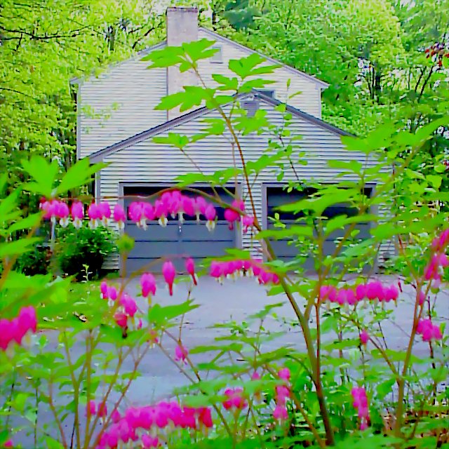
I would suggest turning the color down just a hair. it’s a little distracting
Post actions
WHOA!!! Tone the colors down! The colors being displayed are great but they are over powering.
Post actions
Too much out of foreground blurs the photo.
Post actions
nice idea..the flowers are really blurry though
Post actions
way too oversaturated and dithered. it is painful to look at.
Post actions
that green is too much... too much saturation.
Post actions
Not bad. The color seems to be a little too saturated.
Post actions
i really like the colour contrast of yellow/green and pink. 9
Post actions
Post actions
too much green!!!!!!! Try desaturating this a bit and it'd work quite nicely. As it is - overloads the eyes a little.
Post actions
to many bright colors in the front it takes away alot of intrest from your picture nice work.
Post actions
the colours are blinding me!
Post actions
think it would have looked better without the plants in the foreground
Post actions
Post actions
Wooooo I need my shades for this one! I think you went a little overboard on the saturation there! :o)
Post actions
A bit too much sugar in those colours.
Post actions
green looks oversaturated?
Post actions
Your Bleeding Hearts look like tiny bells, barely defocused. I like it!
Post actions
I would have focused on your bleeding hearts instead of the house, they are the more interesting subject IMO. Nice color and clarity.
Post actions
Too colorful,it hurts my eyes,picture is overexposed,4 from me!






 Add photograph to your favorites
 Add photographer to your favorites


 Photographer found comment helpful.


