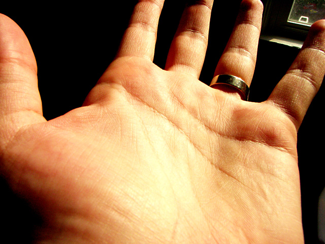
I was originally thinking along the lines of branching veins, but I was attracted to the lines on my palm. Pair that with my memory of once having my palm read, and I ended up here.
Edited for contrast, color, and sharpened.
Statistics
Place: 331 out of 432 Avg (all users): 4.5347 Avg (commenters): 5.0000 Avg (participants): 4.3311 Avg (non-participants): 4.7500 Views since voting: 1005 Views during voting: 383 Votes: 288 Comments: 17 Favorites: 0
Ahhh...with the description, it all makes sense. Even with the title, I would not have gotten it, since I have no experience with palm readin or such. I wonder how many other people failed to see the connection?
The way I see it, almost anything can be turned around to be some kind of 'branch'. So it fits the challenge to me.
On to the photo. Lighting isn't the best. While the background is a nice dark color (minus the window), the lighting on the hand itself is bright. See in the center of the hand the yellowish bright area that kind of erases some detail. In the rest of the hand, we see the finger prints and such, but not there in the middle. Detail is gone. I think a different lighting might be helpful. I'm not sure what you used (no photographers comments) but definately something that's not quite as harsh, in my opinion.
White balance also looks a little off, since the hand seems yellow instead of typical skin tones. This is probably also a result of the lighting.
The window in the background is a bit of a distraction, unless it was meant to be there for some symbolism or something. Even if it was symbolic of something, I think it's almost too small to even really tell what it is. One commenter didn't recognize it as anything, it looks like a window to me, but I supose it could be a lamp with a goofy shade. Anyway, point being, I think that if it serves a purpose in the photo, it's too small to properly portray that purpose. If it does not serve a purpose, then it doesn't need to be there. It's a distraction to the real purpose.
Focus and clarity appear to be ok, if maybe just a tad soft, we still get some nice detail in the finger prints and lines.
Overall, it's an average photo, lacking something to really make it stand out. Good take on the challenge, and need more equal lighting.
~Heather~
I think it's an interesting idea for the challenge, but I don't think the execution of it is very interesting. The angle, the lighting and having whatever that is in the upper right background, all give it more the feel of just a quick snapshot vs. a thought out photo.
I would have prefered a higher angle looking down on the hand, setting the white balance so that the skin had a more natural tone (or switch to black and white), and be more careful of the background.
I like that it's a creative and unique take on the challenge topic.
I love the concept of this one. The image in the distance (to the left of the pinky) is distracting (a continuous black background would have been helpful). The palm is a little overexposed so I'm missing the texture of the palm lines. I like the depth of field and the position & shadows on the fingers.
Interesting take on the challenge. What is that between the ring finger and pinky? I do not see its purpose in the shot, so it makes it a bit distracting. Good shot though.
Very nice. I think this shot could've been better without the window in the upper corner, though. And if the lighting on the palm hadn't been so overexposed. Love the concept, though.
The light is too harsh on the palm practically losing the lines which should be jumping out of the picture. The window in the corner just seems untidy as though an accident.






 Add photograph to your favorites
 Add photographer to your favorites

 Photographer found comment helpful.


