Interesting take ont he challenge. This might be improved in Band white or sepia, or something with a little more contrast. The leading lines are good except they lead me out oof the image instead of to something.
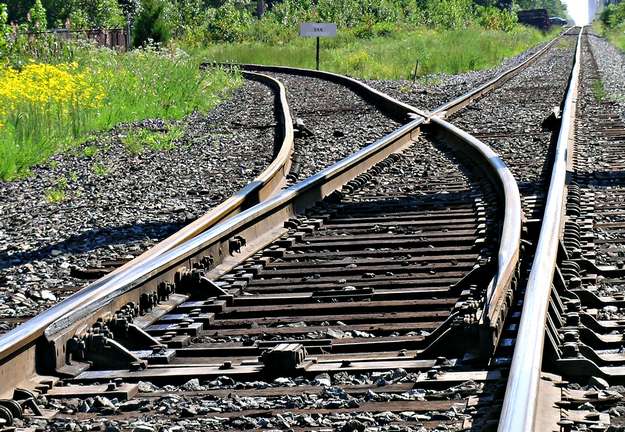
Nice idea, nice colors, generally nice composition but I think it might heve been better if the left rail (is that the word? sorry on my english) ended on bottom side of picture, not left.






 Add photograph to your favorites
 Add photographer to your favorites


 Photographer found comment helpful.


