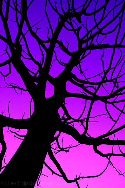
This is an experiment in being as squarely "on-topic" as possible and using the tackiest colors I could come up with in my photoshop tweaking (all within basic rules, mind you). Let's see...
Statistics
Place: 39 out of 432 Avg (all users): 6.0261 Avg (commenters): 6.9412 Avg (participants): 6.0192 Avg (non-participants): 6.0331 Views since voting: 1648 Views during voting: 422 Votes: 307 Comments: 42 Favorites: 0
Thanks to everyone and especially to Neuferland for comments and critique. I think, my experiment (see above) worked - nobody accused me of being off-topic, and I found that about half of the viewers liked the colors and another half found them tacky and unnatural. Of course they are unnatural, that was the whole idea, if I kept the original sky color it would be one booooring photograph. Surprizingly, over a span of the past week I more-less made peace with the colors here, so while for me they still ARE tacky, the overall package kinda works, not as a photograph, but as a piece of pop-art. I can see it on a wall in some New York Upper West Side apartment :)
So, you didn't tell the results of yoru experiment! :)
This is square on topic and the tacky colors seem to have backfired a bit looking at your score, people liked it!
I personally look at it and say, "Cool colors, but very unnatural." The edges around the branches don't seem right for some reason, not exactly sure why.
The lines coming in and out are very nice, leading in, leading out. I'm thinking if you had just adjusted the colors to a more natural blue it would have done even better but we may never know, right?
Nice job.
My favorite of the challenge. Love the starkness and clarity of the foreground as well as the gradation and striking color of the background. Hope this does well for you.
Bright, and nice contrast, but its just not doing it for me.It looks really staged and fake, and I think you could have done so much more with the topic.
What really caught my eye about this picture was the bright colors. But besides the colors nothing really sets it apart from other pictures of trees with branches. However, I like your idea and it's interesting.
8 - Colors and the 'twisted silhouette' obviously really dramatize this shot. Criticism; I would like to see it more 'balanced', either with the main trunk to the left more and more 'branches' on the right, or perhaps centered. Very nice, even though I like the silhouetting, I wonder how this with a 'softened'/blurred effect would have worked. If possible, the only other thing would be if the whole of the canopy, at least on one side, could have been 'framed', may have also made this even more unique.
wonderful colors and shapes. of course there are many photographs in this challenge that demonstrate a similar approach, but yours is the best I've seen so far.





 Add photograph to your favorites
 Add photographer to your favorites


 Photographer found comment helpful.


