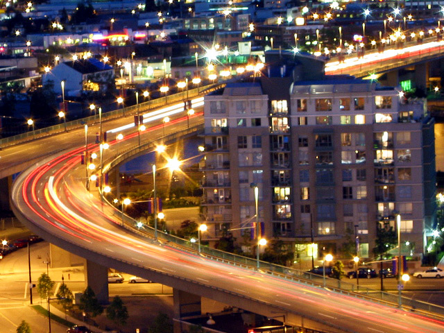
This photo was taken from my apartment balconey with a tripod which, unfortunatley, does not have a level bar; hence all the comments regarding the lack of a true vertical building/horizon.
Excellent placement with areas available. Color and use of time delay is well done. Color and light only add more effect to this well done photo. Some may not like the building in the photo but I think it adds to the oveall effect.
I like the composition with the road curving around the building and the building following the ROT. However, the building is leaning to the left - you need to straighten out your horizon - it's very distracting.
I don't like the title, but not going to mark down for that :) It seems a little tilted though...the edge of the building isn't quite parallel to the edge of the frame. I like the colors though, and the curve of the road there is interesting.
I like long exposures quite a bit... This shot does an excellent job of describing the 'on the road' challenge... As I look at this image very closely, I believe I see some lack of clarity that may have been caused by camera shake. I'm not sure how long this exposure is but I'm assuming it's at least 2 or 3 seconds long. If you were not on a tripod for this shot, I can see where the shake may have come from. If you *were* on a tripod, you can still get camera shake from simply pressing the shutter release button. When I do a shot like this, I setup my composition and framing and exposure, and then let the camera timer take the photo. If the timer opens the shutter, you minimize your camera shake quite effectively... Nice shot!
This is a really cool shot. I looked at it for awhile trying to decide what to do to improve it. The two biggest lights really jump out, becoming the focal points of the picture, I think. The curve is effective and emphasizing "motion" in the picture, but there is so much here, it is difficult to isolate any one thing as the main point of the picture (besides those lights). Not much by way of suggestions, though, because cropping it causes you to lose road, etc. Overall, I think it is a fairly effective shot.
it looks like your camera was tilted a bit. When taking pictures of landscape like this its usually better to keep your horizon completely horizontal. You don't have a horizon on this picture but I'm look at the right side of the building and it looks tilted. Other than that I think its one of the better images in this challenge.
This is excellent. Looks like a nightlife/alcohol ad, and I mean that in a good way. I still see detail on the parked cars, and then all the blurs... I really like this shot.
Seems just a little too bright overall to me, and the building that's fighting for the center of attention seems to be out of focus and slightly distracting.





 Disappearing Cars
 Add photograph to your favorites
 Add photographer to your favorites


