Anna:
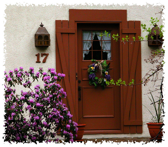
I really appreciate your comments. The light condition were poor since it was raining that day! Also, this is not my house so I couldn't just go and cut the bothering branches! But indeed, they detract. Thanks again for taking the time to comment.
Olyuzi:
Thanks for your very kind comments. It's always surprising to see how hard are people as soon as you put a border. Also, when I see one's for this shot (or many other that are even winners), I wonder what are their criterias!!!!!! Well, you are right the shot itself could be improved (maybe with post-editing which was not allowed for the challenge since at shooting time conditions were rain and foreign house so no branch cutting!!!). Thanks again!
Very pretty says welcome home and in that definately says Home Sweet Home. The boarder you used added to the image and gave it more of a feeling. The colors for the most part are good and the focus is really good. The texture is very nice in this photo and its like you can actually feel the roughness.
As someone mentioned the two branches in front of the door look like you could get hit by them but at the same time they also take away from the door and almost give it an appearance of being cut in 3 pieces. It also needs a little stronger lighting at the top of the door it is just to shadowy.
Over all this is a really homey feeling photo and it really well done. Keep up the good work.
Natalie, I disagree with those who dislike the border. I think it adds tremendously to an already fine shot and gives your photo a very artistic feel. The border draws attention to the stucco texture of the house and red wood on either side of the door, and gives the picture a whole new dimension. Very well done on this aspect.
I like the simple composition too, though I wish the two branches on the side were out of the frame and find the shot to be a bit underexposed. I think a little more exposure would have brought out more of the colors in the wreath, which are hard to see. I gave you a 10. Congrats on very fine work and good luck in future challenges.
I love the postcard feel of the border on this image, and the title in this case does add to the image. I find the branches on the right a little distracting but overall really like the mood.
I think a little more contrast would give those colors some more punch. Of course.. it might just be that there is a great amount of contrast between your picture and your border.
Very pleasing composition, and I like your rich colors. However, in my opinion, I find the ragged border a bit distracting, taking away some of the impact you have captured elsewhere.
A nice red door. It looks a bit dark here, and the colours loose some of their brilliance. I love the light tree limbs on the right. The come into the frame and break up the vertical lines. If the lower one was a bit lower, not to make it look like it was part of the wreath, the photo would be improved.





 Add photograph to your favorites
 Add photographer to your favorites


 Photographer found comment helpful.


