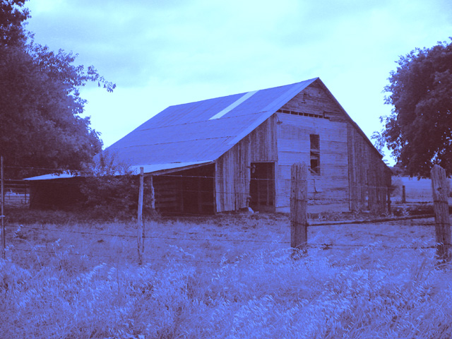
Composition - I like the angle from which this photo was taken. Its a little different than the norm. I really like the way the trees frame in the barn. I could do without the fence, but what can you do? Knocking it down for a few photos seems pretty unreasonable. I like the way the tree on the left has some continuity with the bush right under it, like it's reaching all the way down to the ground. Not a super compelling subject, but for what it is, I think you did a nice job composing this photo.
Technical - I really do not like the colors of this shot. This would be one that I would've made sepia and possibly even added a little grain to it so as to make it look very old. I believe the blue tones in this photo are the main reason it was not terribly well received by the voters. I think you threw them a fastball when they were expecting a curve and it stunned us. I'm not saying its not DUOtone, but it definitely one that caught me off guard.
Overall - I think besides the color issue, the photo is pretty good. Unfortunately the color issue is a very major one and cannot easily be overlooked by the voters, myself included. Best of luck to you in all your pursuits. - Bob
I like playing with unusual duotone colors, but I don't think this quite works unless you're planning to look at it under a "black-light" at a rock concert...
This doesn't look like an actual duotone to me, rather like a color shot you turned down most of the brightness on the other color channels for. I have to grade it down a bit to leave room for things that more properly fit the topic.
It's a nice photo, but i think the saturation/brightness of this colors is a bit too much.. almost hurts my eyes. If it were toned down a bit i think i might like it more.





 Add photograph to your favorites
 Add photographer to your favorites

 Photographer found comment helpful.


