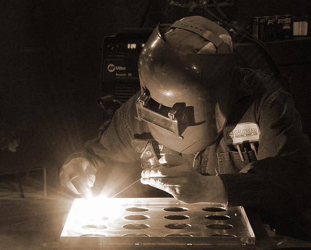
This was actually posed :) It's at my workplace, and i was doing photos for the company's website and brochure, and this was one of the last for the day. It was a friday, so people weren't too busy and were very cooperative. I was afraid the spark would damage my camera, but i was reassured it wouldn't.
Statistics
Place: 26 out of 147 Avg (all users): 6.3667 Avg (commenters): 7.6364 Avg (participants): 6.4588 Avg (non-participants): 6.1429 Views since voting: 1657 Votes: 120 Comments: 12 Favorites: 0
*Critique Club*
Love the way the weld light glows like that. I think this is perfect for this challenge. The overall darkness matches really really well with the bright light.
The angle and framing/cropping is great in my opinion. I really like how you have gotten all of him in the photo. The rigt edge is darkened enough, that you haven't actually chopped off the elbow, but rather it is lost in the darkness, which is nice.
Focus and clarity are really great as well. I love the detail in the hands, the patch on the uniform, and just the overall shot.
I think that the item in the back by his head is a slight bit of a distraction, however, not really that bad, as the main focus is the light really, and the hands, and had I not been TRYING to look at the entire image, I might not have even noticed it. So I don't really think it's a huge deal. LoL at the pepsi ad. You may have to edit those out if you use this in a company flyer. I see so many things where people bleep out the brand names on things because of advertizing issues. Anyway. Great shot.
~Heather~
This shot works well in duotone. I actually think you could adjust the black level a tad to give even more contrast with more darkness in the shadows. I personally don't have a lot of emotional interest in the shot. Technically it's quite good, but without something more... it's more of a stock shot than something to hang on the wall obviously. I do really like how the light is spreading out though.
Neat. Not a topic I would have ever thought of, myself, but it works very well in the tone it's in, seems perfectly natural to see it in that colour, except for the very distracting Pepsi cans in the background. If it weren't for the modern design on those it would have come across well as an old photograph, which is how the rest of it feels.





 Add photograph to your favorites
 Add photographer to your favorites

 Photographer found comment helpful.


