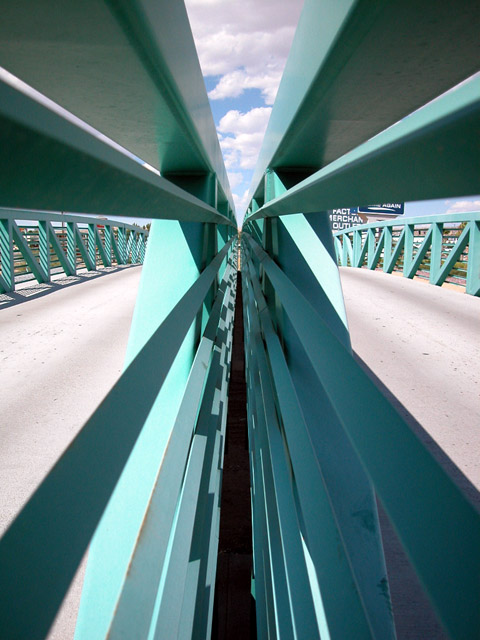
Excellent shot. The sign is distracting on the right side. It detracts from overall photo. Understand that not much choice when taking shots like these. That is only downside. Great color and camera angle is done well to show converging lines.
Excellent structural photo, very strong composition. If those billboards weren't in the background it would be a lot cooler, but you couldn't change that :).
Great symmetry and it just draws you into the picture. The colors work well too. The only gripe I have, and I recognize that it is out of your control, is the billboard on the right, on the right. Other than that, I really like this picture.
I love the angles and the symmetry in this photo... The colors and contrasts are also very appealing to me. The only minor detail that I see (not affecting score) is the signs on the right.. That small amount of darkness tosses the symmetry off just a tiny bit... excellent shot!
An interestingly different view of a bridge. Part of me likes the geometry of this shot, but I also like to see "interest" in a photo, some reason to want to view it. No suggestions, but thought you should know. Photo 8 Creativity 9 Road 8 total 8
Interesting, almost abstract. I find the dark lines down the center rather distracting. I find myself wondering how you got your camera where it appears to be.
The best of the bridge photos. Nice abstract, yes i like this. I would have been tempted to paint out the signs in the top right quarter as they unbalance the shot a bit.
Very cool composition/concept. The lines almost jump out of the picture at the viewer. Looks like a tight space, how'd you manage to fit in there? ;)
Only complaint I've got is that sign just viewable through the right side. I know it was probably unavoidable; it just takes a little of the symmetrical feeling away.






 Add photograph to your favorites
 Add photographer to your favorites


