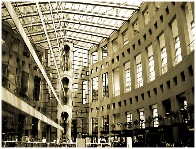
Just a typical bustling sunday afternoon at the central branch of the Vancouver Public Library. The architecture of the library is a phonemonal balance of coliseum inspired curves that reflect in the glass that lines the interior wall of the library's 7 magnificent floors.
This shot was taken around 2pm without a flash.
Post processing:
crop
levels (to increase some contrast)
desaturate
brightness/contrast (to brighten a little)
hue/saturation (to get the sepia)
final curves and levels tweak plus a 25% USM, added a plain white border.
Statistics
Place: 69 out of 147 Avg (all users): 5.7094 Avg (commenters): 7.5556 Avg (participants): 5.7442 Avg (non-participants): 5.6129 Views since voting: 1981 Votes: 117 Comments: 11 Favorites: 1 (view)
*Critique Club*
I'm finding this shot really busy. Lots of lines that really lead to nowhere.
I'm also wondering about the perspective/angle. The strong vertical line (support to the left of the center of the photo) appears to be leaning to the right. When matched up with the edge of my screen, it is leaning. However, the right side seems to be leaning inward as well. Wide angle lens? Sometimes they create distortion and can look a bit odd, with strong verticals curving inward to the photo.
The lighting is also a bit strange. Really bright at the top, to where it is almost washing out the detail in the ceiling. However, it's really dark in the bottom right so that we really don't get any detail at all out of that area.
Focus looks really good. Things seems sharp and lines are nice and crisp. Clarity though is a bit different. There are so many lines that in some places it all just kind of mushes together. Also, the people are really too far away to get much detail out of at all, and are almost a distraction to the building, which is a distraction itslef. lol
I wonder if focussing in on a smaller section of the building would have worked better for me.
You got a nice score, and some great comments, and I feel bad saying that this doesn't really appeal to me. Like I'm the bad guy or something, but it's just not striking any interest with me.
~Heather~
Buildings always provide great lines and details. I like the old world vs. new world feel in this shot. The gradient of light at the top to the dark at the bottom create a nice compliment to each other. And to put the perspective on the shot you have the people at the bottom adding a nice focal point and detail. Nice work. 8 -danny









 Add photograph to your favorites
 Add photographer to your favorites

 Photographer found comment helpful.


