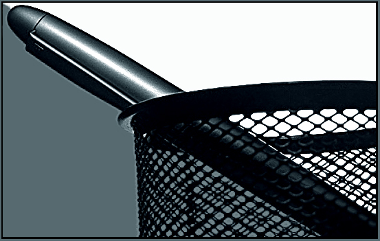
ohh man. this was yours! very nice. I meant to comment on it during the challenge. It seems just a tiny bit grainy. Is that from using the monitor as a background? I think i'm going to have to start experimenting with my monitor for backgrounds too. Thanks for the idea and great job.
This is a cool idea, and very well done, I love the different shades of grey... from deepwhite to dark black. looks like either your cropped a whole bunch or you sharpened a lot, because of the sides on the pen. but it's pretty nice looking... I also like the lighting... -8-
Seems to be some pixellation artifacts along the edges -- I'm guessing this isn't just a close crop but a fairly close shot, therefore. Though obviously a close shot framing the items is preferable to just cropping, in this case it might have been better to take the image from slightly further back and crop to avoid that.
I'm curious to know if we've seen some of these props before in previous challenges. I like the concept of splitting the color with the pen, but I don't think it really gives this the wow factor. This photo has a very layered look to it, like the subjects were just stuck on this diagonally split background. Its a good image, but not exceptional in my eyes. best of luck.
The idea, composition, fitting the challenge - all excellent! Its only disappointing that with all that, the image suffers techincally - there are a lot of jagged lines, causing the pen to look iike it was a cutout that was pasted into the image. You'd get a 10 for content though :)
Neat effect, nice esposure and contrast. Not sure what to make of the crop, something about the composition just does not feel right to me (maybe should have more or less at top left, not sure).






 Add photograph to your favorites
 Add photographer to your favorites


 Photographer found comment helpful.


