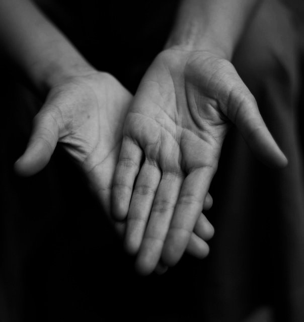
Greetings from the Critique CLub I very much like the composition of your image. The classic triangle shape is almost always a winner, and your image shows why. The viewer keeps within the picture, wandering back and forth. It might have helped if you could have avoided the slight distraction in the right top background. Or, add more interest in the background by repeating the softness in another area.
You have received comments from several respected members of the DPC community suggesting that the hands be in sharp focus. I agree. This is a great advertisement for "bracketing". Look at your image at a higher aperture and see if it's better. Another suggestion would be to try this very nicely composed image at a higher number aperture, with slightly more light on the hands - and if you have it, a tripod to help you get it sharp. If ripod, bracing the camera on something would work.
I'll look forward to seeing more of your work on DPC.
The image begs us to concentrate on the lines and details of the hands, but unfortunately they are not in sharp enough focus for us to do so. It's a good composition, other than the slight distraction in the top right corner and I like the use of black and white. Great effort.
Picture is interesting but at first glance I would pass it by due to low contrast and softness. Fear you will get bad scores with the average voter. However, since the 'point' of the image is the lines in the hand it might be better if the image were a little more contrasty or less soft. Good comp, crop, DOF and POV. 6
I like the idea of this very much, but it lacks the detail in the hand. Maybe zoom in a little more on a single hand and up the contrast and make sure the focus is ultra sharp.







 Add photograph to your favorites
 Add photographer to your favorites


 Photographer found comment helpful.


