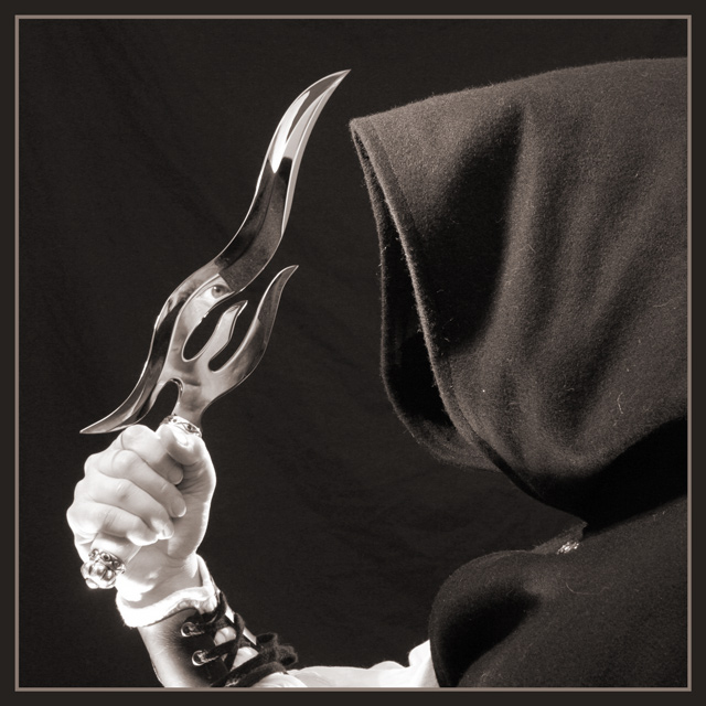
Getting the reflection and lighting just right took three hours (thanks Adine for being a patient model!). The lighting was provided by two 100W bulbs in construction lamps (from below and above left) and one small halogen light spotlighting the hand from behind.
Here's the edit as suggested by various commentors (not allowed by this challenge's rules)
Statistics
Place: 23 out of 147 Avg (all users): 6.4318 Avg (commenters): 7.4706 Avg (participants): 6.4433 Avg (non-participants): 6.4000 Views since voting: 2026 Votes: 132 Comments: 19 Favorites: 4 (view)
*Critique Club*
There really isn't much I can offer in the way of suggestions for improvement here. This is just a really wonderful image.
If I HAD to be picky picky, I'd suggest trying to remove some more lint from the hood. There are a few straggling pieces on there.
Otherwise, Not really much I can say.
The angle and framing/cropping is perfect. I love how you have caught the part of the face in the reflection. This is what really makes the shot for me.
Focus and clarity are great. Awesome detail in the hood, and the knife and the reflection.
I like how you have the person to the right and the knife to the left. I think that this makes for a really great visual appeal.
The duotones work perfectly here as well. I do not think that color would have worked as nicely. The reflection would seem odd if had been in color, I think.
Nothing more to add. Simply Great.
~Heather~
Somehow the pose looks stiff, almost as if the model's all tensed up and thinking 'Damn, when can I put this stupid knife down and go home?' It doesn't feel natural (not that it WOULD be, but it could feel so), and that detracts a bit from the overall appeal of the shot. Nice reflection, though.
excellent shot.. well planned theme and the reflection in the blade is a great touch. I really enjoy a photo where I can see and feel the photographer's intent. In a photo like this, I have to be a bit picky :) The hand looks a little over exposed and the lint on the hood and cape are also a little overly visible. When taking the time to organize a photo like this, I would always go the extra mile to get perfection :) = 9
I almost missed that the face was visible in the knife at first. As interesting as that blade is, I wonder if something a little less irregularly shaped would have worked better for this. Maybe a slightly different angle so the eye wasn't nearly cut off? (No pun intended.)
it took me a second to see the face in the sword, interesting effect. the composition is alot well done. The stray white fibres on the dark cloak detract a bit though :)
Nice composition and eye effect in the knife, cleaver idea. Hand and arm do not carry the same sharpness as the hood and cloak (possibly a tad overexposed in that area?).
great shot..... I think it would be infinantly better if you darkened it and raised the contrast..... the hand looks a little too light and the backdrop is a little too obvious.... also I find the little dust and threads on the hood a little distracting.... definately worth reshooting.... I love the reflection in the sword.... love the composition, just need to improve the execution in my opinion... good luck, Todd.
Great concept and setup. Too bad you couldn't get your background and hood a little darker. You can see the wrinkled backdrop and the lint on the hood is also distracting. It's been my experience at DPC that people really pick up on the little things. I guess I gotta follow suit. Cheers. 7 (could have been an 8)
Love this one. That hand and dagger are well lit. The shroud is great also althogh a little less of it would be better, and instead zoom on the hand, arm, and dagger.





 Add photograph to your favorites
 Add photographer to your favorites

 Photographer found comment helpful.


