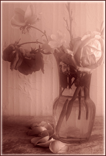
Somehow the softness, while pretty is not effective to me. Would like to see a little more crisp image...just me. Great concept and well done duotone. thanks
I know you did it on purpose, but the blur makes it look like there's a dirty window between me and the subject, and is distracting as hell. The lighting is very bright and harsh on the right and very dark on the left, without seeming to highlight where we're 'supposed to look' in any way. The only real focus of attention I can find is the fallen petals at the bottom or the shapes on the wall ... which I doubt is what you intended.
Very vintage looking photo. I would like a slight bit less on the soft focus/diffusion to make out a bit more detail in the petals. And the color a bit more on the sepia/brown side. The pinkish hue works great, and just an opinion. Nice job
i like the choice of colors, and the softness of it is nice, but that fading gradient border.... maybe i've just seen it too much, but it doesn't do it justice. a nice simple border would have done just as fine if not better for me.







 Add photograph to your favorites
 Add photographer to your favorites


 Photographer found comment helpful.


