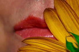
This was one of the last pictures of a shoot for a friend of mine. She had mentioned during the session, that her best physical attribute was her lips. On our way back to the car, she grabbed a sunflower and started playfully kissing it, so I turned her into the sun and shot a couple of frames. I really liked what I was seeing so I set my lens to macro mode and got in close and fired away.
We came away with some great portraits, but this one hit me like a ton of bricks later when I was going through the files of our shoot. I didn’t think it needed any editing, but just for kicks I started with a few color adjustments.
It began with a deepening of the yellow petals by burning the shadows of the blue channel at about 8%. It looked pretty good so I did the same on the red channel for the green of the stem. After that I couldn’t stop myself. I selected her lips and put and feathered the selection at about 0.5, where I proceeded to burn the shadows of the green and blue channels at 4%, to give her lips an almost painted look, which I liked in the end. The skin tones required no correction (but I did try, by selecting her skin, adding blue on the curves and changing to CMYK mode. Where I went to selective color and added 100% yellow to the magenta channel. But in the end I thought the original tones looked more pleasing). A little unsharpmask at 151% and there it was, my first entry into DP Challenge.
Statistics
Place: 282 out of 284 Avg (all users): 3.2351 Avg (commenters): 3.0769 Avg (participants): 3.0068 Avg (non-participants): 3.4487 Views since voting: 1074 Views during voting: 450 Votes: 302 Comments: 32 Favorites: 0
Image Size As most commenters have mentioned, the Image size is unneccessarily small and especially now I see that you're using a 300D, I can't see any reason for it. A smaller image makes it much harder to really judge the contents – harder to see whether smaller details are sharp and even what the details and textures are.
Composition/ Content The diagonal of the flower across the frame works reasonably well, as does the framing it provides to the lips/ face. However, it feels a touch too closely cropped to really be a portrait (rather than just a macro of lips).
The harsh light has highlighted the shininess on her skin – not flattering in a portrait image.
In such a close study of the lips the make-up would benefit from being much more accurately and neatly applied – perhaps using a lipliner to create a neater and slightly darker edge and then applying the main colour being within. Instead it looks as though your model has applied lipstick outside the edge of her lips (commonly done to make them look larger).
The dark brown edge on the flower petals is not attractive. Again, when presenting a close-up such as this, this kind of detail is much more important than in a wider angle portrait.
Camera Work - Technical I don't think that shallow DOF works here – the out of focus cheek area on the left just seems very odd. Given that we're seeing such a small area of the scene, and given that there's not really much variation of depth within that bit of the scene, I think sharpness throughout would be better.
Digital Processing - Technical The skin seems overly red to me, though I'm unsure whether this is down to post-processing or the model's natural skintone.
Fits The Challenge I'm fairly open in terms of the definition of portrait – I don't think it has to be a full face or include neck and shoulders to be considered a portrait – and this does share something about how the model views herself. However, the majority would not consider this a real portrait and that has clearly harmed your score.
My Opinion On The Photo An interesting idea but, with more care taken over props, lighting and make-up, as well as consideration of exact cropping, could be stronger.
i was going through the colour portrait score pages and thought i was having a spell of deja vu
(my entry for last weeks members challenge).
Our PP almosts matches too haha.
Uncanny ;)
I got third to the bottom my first challenge. Welcome to DPC! Keep it coming. Up to 5.7 for perspectives and I have greatly appreciated the comments on my previous shots as it has helped me to not stop at 'hey that's cool' with my pictures and to shoot for WOW. Good luck.
sorry but this image is way too small, also there is a strange blur on the side where you can see her face, I like that it's diffrent but doesn't really meet what I call portrait.
it's important that any oil on the face be wiped clean because it is highly reflective in direct light. it doesn't look like you used the camera flash becaus of the way the shadows fall across the petals, but it is important that you also diffuse the light in some way
the head on flash is almost never a good choice..trade it in for a longer exposure and perhaps close down your iris (for dof). the size on the picture doesnt help it either.. also remember to keep an eye on your models look..dab the sweat ect.. sorry for the bluntness but i hope these comment help you in later challenges.
This has no sense of portraiture. You need the full face, or profile. Also, the shot is way too small. It needs to have 150k and your larger dimension be 640 pixels, so that it is large enough to critique properly.
This is very small, which, for me, makes it more difficult to formulate a comment on. The colors seem very saturated, and the lighting, at least from what I can tell, feels harsh. A tighter crop on the lips and flower might help the composition by cropping out the unflattering shadow on the left side.
Good idea. Needs some work, just cleaned up in photoshop. Immage is very small. I had this problem too when I started someone sugested the tutorials on getting your immage ready for DPI. That comment helped me the most. Good Luck
An interesting shot to be sure. I sort of view this as a macro shot rather than a portrait. Also, would like to see a larger image so that it can be properly rated for quality.
Interesting. Nice juxtaposition of elements, but I think a portrait should be of the whole face. I want to say the picture should be larger, but I'm not sure I want to look at a huge set of lips.
This is a little small in size and not really enough of a face to be considered a portrait, I don't think. I like the idea of the flower. Would just like to see a little more face to go along with it. You should definitely use the full 640 size when submitting. It will help us to see more of the details of your photo. :-)
I think this shows potential. Could use some better lighting and colors. I think the flower needs to show more. A brighter yellow would help. Sharper focus would also be good. Larger picture would help.





 Add photograph to your favorites
 Add photographer to your favorites


