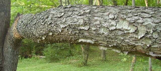
If you had moved around and ignored trying to use perspective to demonstrate the 'thick' effect, and used the contrasting thin vertical lines of the tree trunks in the background with the thick horizontal line of the branch in the foreground this theme would have worked.
Yes, it's a branch and it meets the challenge, but for a higher score there needs to be something that holds my interest more. Using a different angle, different lighting conditions and adding more "umph" in post-editing would have helped you here.





 Add photograph to your favorites
 Add photographer to your favorites


 Photographer found comment helpful.


