*Critique Club*
From what I know, this is not considered Duotone.
As for the image itself, i think it's a nice image.
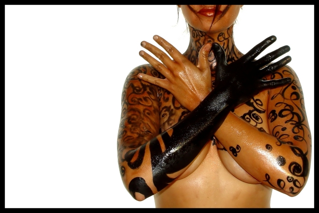
The angle and framing/cropping are good. I like how you have placed her at the right edge of the frame, rather than in the middle. I wonder if the left side of the frame might have worked as well. Actually, I wonder if it might have worked a bit better. The way we are seeing this, the right arm (our left) is kind of the center of focus as it is nearer the center of the photo. This arm is quite smudged. If she had been placed on the other side of the frame, then the arm that is not smudged would be nearest the center of the photo and then would be the main focus in my opinion.
This might make it look a bit neater. As is, the first thing I notice is the very smudged arm.
The focus and clarity are good. I like the way her hair falls over her face. The detail shown in the texture of her arms is really good. I expecially like the detail in the arm that is painted blck. The lighting on that arm really brings out the texture.
I tink that the lighting is good, but maybe a little harsh on the left forarm (our right). There is a bit of a glare there which doesn't really fit with the rest of the photo.
Overall, a nice image, but in my opinion does not fit the challenge at all.
~Heather~
This is most excellently done if only two colors (would like a copy of your Duotone setup if you use Photoshop), but doesn't really have the "feel" of a "traditional" duotone.
Hope that was a non-toxic pen!
I find this shot oddly interesting. I wasn't sure, at first, if I liked it, and have had to come back several times to give it another look. The composition is quite visually appealing, and your concept is quite unique (at least to me). The one little thing that really makes this shot for me is the spikes of hair hanging across her face. Don't know why, I guess it is just something a little unexpected and it adds some "kick" to the shot.
Very nice, but not at all sure about the reflection from the flash. The off-centreness is cool though, as is the bodypainting and the hair hanging across her face. Good work. (8)
Looks like sweaty work under the lights :) Interesting composition, and great skin tones on the exposure. It doesn't look much like a traditional duotone to me, but that's a wohle other argument.
Is this the same woman who posed for "The Naked Chef" several weeks back? Whatever the case, gotta like this! My only beef is the somewhat harsh flash on the oily skin on the arms. Or am I just upset that the arms are in the way? :)
Wooah, awesome. Where do you come up with such models? If only i could be so lucky. I especially like the strands of hair coming down over the lips and the fact that the head is cut off. I bet that will bother other people, but i think it gives it a nice modern look, or post post modern or contemporary or baroque or whatever people call it these days. would be great in a body art magazine or billboard, etc. The only thing i don't like are the harsh highlights on the arms, especially the black one, although I realize that they are to give the skin a polished, oiled, bronzed look. 9
what happened to the markings on her right arm? I like the image, though the markings on her arm look smudged or something.... detracts from the image in my opinion..... some will claim this is not duotone.... for mine, I like the look and whilst not within the 'letter of the law' I think it desrves a decent score.....
Ok, it's not a duotone when you use multiple colors that aren't either black or white (there's a sepiaish color, and a red one, here). To me. So I'm grading it down to leave room for things that fit the theme better.
black and white and one color make three tones... therefore it really does not meet the challenge... however on it's own it is a really cool photo! quite interesting...
I think your going to get ripped on because its not exactly duotone. From the photography perspective, very interesting photo, I hope to see what you did to this girl's body. I love the off centering of the subject, with the blank space next to it. The lighting looks a little harsh in a few places, especially on the black of the arm. This photo is extremely artsy, and has real potential, if you play around with the lighting a bit, and don't enter it in duotone. The lips really give it away. Very cool photo though.
Great shot. Too bad you didn't "doutone" it. Sepia wouldn't have worked as well as B & W in this case. Why did you not convert to B & W is my only question? You entered the wrong pic didn't you? Too bad. Sorry. 5





 Add photograph to your favorites
 Add photographer to your favorites


 Photographer found comment helpful.


