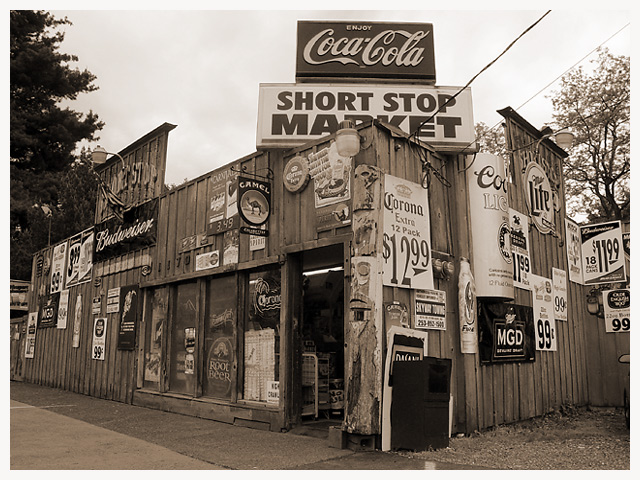
This is an old store and gas station I drive by all of the time and I have always been wanting to photograph it. This seemed like a great challenge for it. So I road out there on my bike and I used the wide angle adapter on my camera to capture this shot. That gave it an interesting perspective while helping to eliminate some background clutter. I don't normally use borders but I wanted to create a photo much like the old sepia photographs with the white borders.
Statistics
Place: 45 out of 147 Avg (all users): 6.1138 Avg (commenters): 7.2222 Avg (participants): 5.9778 Avg (non-participants): 6.4848 Views since voting: 1415 Votes: 123 Comments: 20 Favorites: 0
As I mentioned before, I think this works very well in the "duotone mode." Though I acknowledge the other comments about how colorful the signs would be, I still think shooting this in color would lose a lot of character and depth. I think it would make it raucous and busy.
By using the tones as you have, it does give it a vintage feeling. Looking at this picture makes it seem as if I have stepped back in time somehow, and am looking at the corner store for a small town near here.
My only complaint (and I had to look a while to figure this out) is that the cropping feels unbalanced to me. I think that since the end of the building, per se, can be seen on the left, it may give more of a sense of balance (at least for me) if it wasn't "chopped' on the right. Or conversely, crop it slightly tighter on the right.
Again, I think this is a very well done shot, and I apologize for not being able to offer more "help" with it. I enjoy your work.
If it weren't for the prices, this would look entirely like an old picture of an old general store, which is neat -- and presumably the idea. Good job on making it look very old-photograph.
This is a good shot - visually fascinating; but the first thing that strikes me is 'why isn't it in colour?' (and I don't mean because it's a duotone challenge).
This shot is an excellent example of how using duotone can improve a picture. It really gives it character, I think. In color, I can imagine it would be busy, or down right obnoxious.
Great scene! Looks like it would be an interesting place to visit. The tone is well managed overall, but I do find it a tad strong. Still, its a very nice shot.
interesting subject, the lens/barrel distortion adds to this image. the lighting looks like an overcast sky which would make the image loose some texture. maybe play with curves or try with more interesting light. 8
the angle of the building is nice, but i seem to always look towards the sky, only to notice a rather uninteresting sky.. nevertheless, it's interesting to see all those signs :)






 Add photograph to your favorites
 Add photographer to your favorites


 Photographer found comment helpful.


