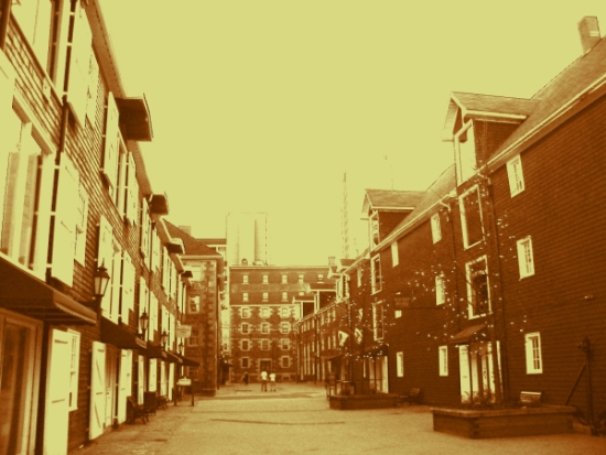
The image itself is not bad, the buildings appear to be in very sharp focus. The composition is also very good and nicely balanced out.
My problem with the photo is the harshness of the yellow. When doing sepia tones you need to try for more of a amber color to it and less yellow. The sky is so yellow as are the shutters on the building to the left they're extremes and needed to be softened up. Changing your settings slighting when doing sepia tones will add a lot to the image.
In all the photo is in good focus and the composition is really good. Keep trying with the sepia tones and you will loose the harshness this one had and will get the real beauty of sepia tones.
I like how this has an "old" look to it. I think more of an amber would be better though. The yellow seems to be causing some details to blow out, especially on the left side windows.
I like the composition - the long lines with the figures in the distance adds life. I think other color choices would have added strength (or softness if you prefer) - but this color...
I am not really thrilled with the yellow tone here. It really blows out the shudders/doors on the left. Overall it is just not that appealing of a color here. Sorry





 Add photograph to your favorites
 Add photographer to your favorites

 Photographer found comment helpful.


