Detailed analysis:I would like to address the comments made during the challenge about the main features of the image that I feel help/hurt the overall photo.
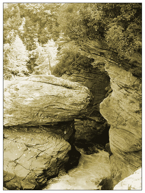
1.) Contrast - This image is full of texture and would have a lot more "punch" with more contrast. Higher contrast could help provide more depth to the image and draw more interest.
2.) Cropping/Composition - As I stated in my initial impression of this image, it's a great study of texture. The river branch is lost to the stone outcroppings and tree textures in the background. I tighter crop might help emphasize the river and make it more relevant to the challenge, but then the photo would lose some of what makes it a good shot (back to the texture thing again). Perhaps moving back some and shooting more of the river to show it cutting through the rocks might help. As it stands, the river seems "chopped off".
3.) Color choice - Personally I like the sepia tone to the image, but I've always been a fan of b/w and sepia images so I'm biased there. Perhaps a color version would help bring out the water a little more. If the water was a blue color, it would be a nice separation from the browns/grays of the rocks and might help fit the challenge a little better.
4.) Border choice - It wasn't really mentioned in the other comments, but I feel it should be addressed. IMHO The white border does nothing to help this image. Personally I think it's too wide and detracts more than it adds to the image. Then again, I usually don't like any borders.
Overall Impression: This is a great photo. I love the textures and the coloration. Increasing contrast would help add depth. This would probably do better in a different challenge.
As a side note I noticed that this is only your second challenge entry. Good work! Keep shooting and I look forward to seeing more of your work in the future.
the rocks are so dominating in this photo that at first i didnt even notice the stream. cropping the image would have been better. water is highly un-noticeable.
The shadow loses the river and combined with the composition makes it seem like the rocks were what was being shot. Also, although I like that you took a chance and broke with the norm, without the title and lacking in any junction or 'branching' in the waterflow it just makes it seem more like a shot of a river rather than a river branch specifically.
Is it just me or does the rock on the right look like a face to you as well? it even has hair - showed my family and no-one else sees it!!!!
Good picture -
sorry, don't like the brightness and contrast balance, the almost white of the trees in the background takes away from the closer branches hanging over the river "branch"
I think this could have used a bit more black/dark grey, as it looks a little washed out right now. It should be easy to fix if you choose to do so. Still, this is a very pleasing image, and I'm sure you had to walk a good ways to get it! 7
meets challenge. Like the tones but wish the contrast were a little higher - i.e. the whites whiter and the blacks blacker. Creative idea in a challenge full of uncreativeness. 6
This was too tall to fit on my monitor. I had to scroll to see the whole picture. This is a good subject for montone, but I would have tweaked the brightness and contrast to bring out more texture in the rocks. Also, the trees in the background tend to fade out. Maybe they should have been cropped out, but that's just me.
This looks like an amazing place. The overall composition is pleasing. I find the tones to be a little too green for my liking and I also wish there were a little more contrast.







 Add photograph to your favorites
 Add photographer to your favorites


