*Critique Club*
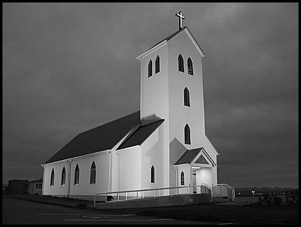
Wow...the focus and clarity here are supurb. The lines are so crisp and clean that this almost looks like a model. The building is so flat, and most of all so CLEAN. Look at how white that building is!
I'm not a religous person, but I reallyl ove the way the cross on top stands out so perfectly. Like it's glowing or something.
They really have this church lit well. And I think you took advantage of that nicely.
The angle and framing/cropping are good in my opinion. I like how you have placed a little space in front of the church for 'breathing room' I think it's very effective. I am wondering though, is there a bit of wide angle lens distortion? I say this because if I line up the vertivals with the edge of my screen, the ones on the left of the screen appear to be leaning to the right and the vertivals on the right seem to be leaning a bit to the left. Everything is leaning inward. There really isn't a true vertical in the shot that I could find. Mind you, this is only a obsessive compulsive distraction, and doesn't seem to effect the photo in a bad way, rather just an irratation to me, who actually sits and lines these things up. lol
I like the tonal range (is that the 'proper' term?) I see nice white whites, and nice black blacks. The sky is beautiful, and nice for this image.
What makes a photo 'icelandic'? I see this was taken in Iceland, but what was the giveaway? Is there a certain style or something that is considered Icelandic?
A really nice photo. Great job.
~Heather~
I just love this shot. Love the B&W, the repeating pattern of the windows, and especially like the "stark" white of the church against the stormy sky. The white (lighted?) cross is perfect. One of my favorites.
One of my favourites this week. Good composition and the b&w tone is perfect. So is focus and cropping. I don´t know how you could have done it much better. Meets the challenge very well. Well done and good luck!
I like how the church is clean and flat-seeming, almost like it's made out of cardboard, against a gently cottony sky. Nice textures, especially played against each other.
this is Iceland, yes? While I am drawn to Icelandic pictures, this one would have drawn me anyway - the ethereal light on the curch and the contrast against the sky - simple forms and angles that don;t clutter a simple, elegant composition. The only things I find distracting are the handiicap ramp and the parking lot. The hadicap ramp has to be there after all but you could crop the lot (although I sort of like the connection between the ramp and the handicap sign could you find an angle to make it more obvious?) I like the low mountains on the horizon. 8
Chuch itself is great and the contrast with the cloudy sky works (this must be in Iceland!), but the foreground is distracting. Probably wasn't much you could do about that...






 Add photograph to your favorites
 Add photographer to your favorites

 Photographer found comment helpful.


