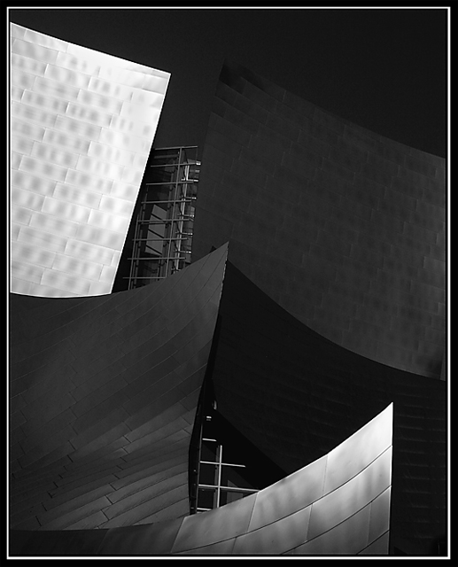
Did a quick editing on this due to time, wish I had longer to work on it.
Converted straight from raw format
Played with levels
Desaturate
Shadows/highlights
Cloned a couple little spots on the facade
Burned some on the highlighted area
Crop, border, save for web
Statistics
Place: 106 out of 343 Avg (all users): 5.7899 Avg (commenters): 6.7368 Avg (participants): 5.7310 Avg (non-participants): 5.8817 Views since voting: 1007 Views during voting: 321 Votes: 238 Comments: 21 Favorites: 1 (view)
Masteful toning and an intriguing viewpoint make this a visual Guinness for me!
: )
Only one small criticism which is that there seems to be some strong NeatImage or noise redcution applied, which has removed some of the realism.
Thanks for the nice comment Imagineer. Coming from you, that's like Eric Clapton telling a kid in a garage band "great music." :-) And thanks to all for the nice comments.
Nope, no Neatimage or noise reduction in this one (it does look like it though). The building is made of stainless steel plates, and is really smooth all over.
What great lines and composition! Really beautiful job here. My only suggestion would be to perhaps make the black border more of a dark silver to match some of the tones in the image. Otherwise, great job!
Good contrast, but I'm having trouble focusing on anything. I think it's just not very interesting to ME. But I cna tell alot of effort went into it, so I vote 7.
I'm not sure what the shapes are, but I like them. For me though, the two dark gray ones detract from the high contrast and I find the metal behind these shapes distracting. I do like the composition and the white border is a nice touch.
Looks like a Gehry building. I like the composition, could probably benefit from a little bit more daylight reflection, perhaps at a differenttime of day.







 Add photograph to your favorites
 Add photographer to your favorites

 Photographer found comment helpful.


