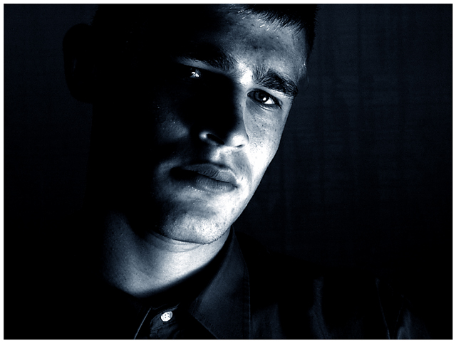
Hmmm... My main issue with this picture was the lighting, but your other comments suggest that atleast those who commented mostly liked it. I don't like blown out areas. They just draw the eye and distract from the rest of the shot. Perhaps you did it on purpose, but did you try diffusing the light with some cloth or bouncing it off something so that it wouldn't be so harsh in those places?
Other than that.. I like this shot. I like the crop and composition. I like how there's more space on one side than the other. I like how the darkness envelopes the subject. A tad more light on that one eye would be nice.
I also don't like the white button, but it isn't a big deal.
Overall it's a strong picture that went up against some very great shots. I personally think that it would've done better without the hot spots. Focus looks pretty good to me. The most important thing with portraits is to have the eyes in focus and they seem to be.
I think this is oddly cropped to place too much emphasis on the chin and neck. The eyes are what is compelling and they need to be in a better place. Also the negative space on the left and right are too balanced. What about a tight crop on the right, leaving all the black on the left and then crop the bottom some. at least above the button. 8
The lighting on the cheek/neck is very harsh, and distracts the attention from his expression. This is a coulda-been-great that is instead just kinda neat. Good concept. Better focus and lighting might well have gotten a 10 from me; as it is, 7.





 Add photograph to your favorites
 Add photographer to your favorites

 Photographer found comment helpful.


