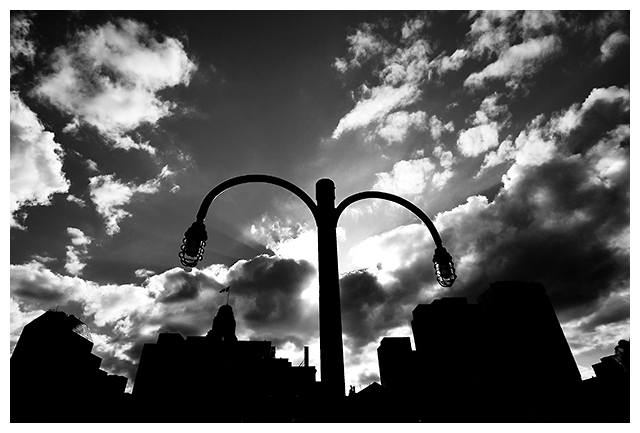
Light standard on the wharf at Halifax Harbour. Tons of editing with this one. Most of the effect was created in PS CS2 RAW editor.
I like this shot a lot. I like how all the buildings lean into the light standard, making it even more of a focal point.
Some people will complain that the subject is too centered. I think this is a situation where the rule of thirds doesn't apply.
I have no idea how this will do. If it's anything like my last few submissions, it should be in the 4.7 to 5.1 range. Don't care about the score on this one. I'm submitting because I wanted to try out this technique.
Statistics
Place: 82 out of 343 Avg (all users): 5.8879 Avg (commenters): 7.1667 Avg (participants): 5.6944 Avg (non-participants): 6.2045 Views since voting: 1086 Views during voting: 319 Votes: 232 Comments: 8 Favorites: 0
The sky is very dramatic, and the angle you chose to shoot at really adds some *oompf* to the shot. The blacks are very clean and it sets up a nice contrast (thus, meeting the challenge very well).
Compositionally, after studying this for a couple of days, I think you might be right about the centered composition. I tried imagining it in the lower left and right corners, but it just doesn't feel balanced that way.
Now, when I look at this, had I voted in this challenge, I think I would have given it a 7 or higher. Technically, it is executed to perfection (or as close as we can be), but perhaps the lack of "emotion" in the shot hurt it some. There is not much there that the viewer can connect on, especially in a global market. If a person if familiar with this area, it may evoke emotions. Or if they happen to have an affinity for lampposts, but for the average viewer, it is technically well-done shot of an inanimate object.
Good work, and best to you in future challenges.
karmat
Well, this image actually did better than I expected. Pretty close to 6.0. But what's up with all the frickin' 2's. It seems at least 10 people judged that I have no photographic/editing skills whatsoever.
Compositionally quite strong. I like the title, and in particular, I like the sunrays. Would prefer to see more space between the 'anchor' and the skyline. 9.
I like the lighting and the way you captured the sun's rays. Background is a little too busy. Maybe try a different angle to isolate your subject and make it stand out more.






 Add photograph to your favorites
 Add photographer to your favorites

 Photographer found comment helpful.


