Greetings from the Critique Club
By Inspzil (who entered a photo for duotone called "the castle")
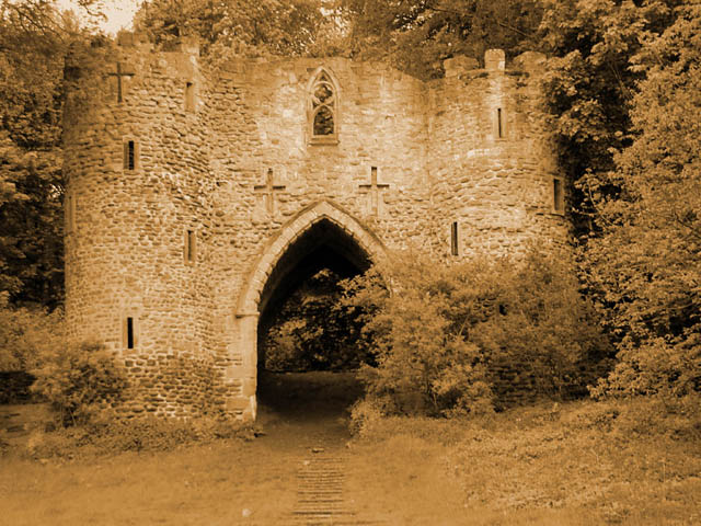
Composition - The composition of this photo really needs something to make us see this differently. It is not a compelling enough subject where a head on, straight up view of it is going to awe me into giving you a 10. I think this needs something to show some perspective in this photo, even if it leads us to believe things that aren't true. For instance, taking the shot from extremely close looking up, so we think the castle is quite tall, when in fact, it's more like "castle Jr."
Technical - I'm having a problem judging the horizon on this pic. It looks fairly level when I look at it, but every time I go back, I doubt that it is level and I still can't decide what way its off. The landscape doesn't help that perception at all either. I feel however that the building is actually photographed on a pretty level plane. I also think that this is a little bit too brown. I'd have liked to seen the brown a little less saturated.
Overall - Not a bad picture, and I think it was scored fairly. It's a worthy subject, but you need to give it something besides this very straightforward angle. Well I hope this might have some impact on the future pictures you take.
This is a gorgeous shot, but I would have picked a slightly different shade -- this one is somewhat sickly -- for the sepia. Perhaps a less intense one.
A little more contrast/blackpoint might have helped the castle jump from the background a bit more strongly. This might have been a 9 or 10 ... but even as-is, definitely 7.
The tonal quality of this photo is just a little too brown for my tastes. A worthy subject, but not an exceptional one. I think an alternate perspective might do this castle a bit more justice. Not bad as is, but I think there is a better way to make us perceive this.
if there ever was an image to do in sepia this is it, this is a beautiful picture, also reminds me of U2's Unforgetabble Fire album cover
9 for now could go to 10






 Add photograph to your favorites
 Add photographer to your favorites


 Photographer found comment helpful.


